Journal: A Stickered-Up Formula 1 Car That Manages To Look Just Right

A Stickered-Up Formula 1 Car That Manages To Look Just Right

By Joel Clark
July 16, 2015

It really is about time I featured an F1 car, as Formula 1 is where my true love of motorsport lies.

To start at the beginning, we need to go back to my favourite Scalextric car, the Fly Saudi-liveried Williams of the early ’80s. Many a brotherly fight occurred if my younger sibling thought he could race it when I wasn’t there, and from then on I became a devout Williams follower. Give or take one or two examples, Williams have always produced great looking liveries, an accolade not many other long-running teams in the paddock can lay claim to.

In my past life as a creative in advertising, I had the all-too-frequent problem of trying to fit a shed-load of messages and logos into a single advert, be it poster, print or TV—all without making a dog’s dinner of it. This is where I can draw a parallel to the hurdles designers face when attempting to give equal status to four or five different sponsors.

This doesn’t seem to be much of an issue nowadays, as most cars are dominated by one major sponsor, though the stack of logos on the nose cone is luckily still in full-force today. Even after you have worked out a design, having given equal coverage to each logo, it then has to work when applied to the actual car!

That’s why the speed icon I’ll be focusing on is the Adrian Newey designed, 1992 World Championship-winning FW14B, driven by Nigel Mansell. Or “Red 5,” as it was affectionately known. In my opinion, this era of the early ’90s produced not only the best-looking cars (I’m referring to the shapes of post-’60s F1), but also some of the best ever F1 liveries. It was also the era that finally had me hook, line, and sinker into F1, as this was the time I worked at the Silverstone Circuit, creating by hand vinyl racing liveries.

In my opinion, the 1992 Williams captures what makes the perfect-looking race car. In much the same way most people would try emulate a classic wedge shape if asked to draw a supercar, I think the same can be said of the FW14 and Formula 1.

Try and sketch a better-looking race car!

Its good looks also helped provide a great canvas on which to apply a livery. As a result, the hurdle of how to get that equal-billing design actually onto a svelte race car was suddenly made a lot easier. The FW14 manages to house five major sponsors, all with enough ‘air’ between them, and all coming together to make what I think is the definition of a racing livery.

What makes a good livery? One that makes your eyes pop with excitement, and has a great sense of purpose—even when stood still (the amazing shape of the car helps again here). When flying past, its body leaves neat yellow, blue and white entrails, with a dash of go-faster-red in there for good measure.

Interestingly though, and atypical, is how each of the sponsor’s logos break the car down into its component parts. The side pod, air intake, engine cover, etc., are all split from one another. This should have given the impression of five different cars bolted together, yet it all somehow gels to work well and thus, stays in the minds of fans when asked to name an iconic Williams car.

Mansell’s crash helmet design also neatly ‘sat’ in the overall look…of which, thankfully, he never changed every other race! (Don’t get me started on that subject…)

Writing this feature reminded me of a particular design that also faced the very real problem of equal billing to more than one brand—but, unfortunately, failed. It also happened to be designed only a couple of doors down from my old office, in my first ad agency.

I’m referring to the 2000 BAR Honda, with the seen-at-launch split 555/Lucky Strike tobacco company design. This, I’m afraid, is a prime example of trying to be too clever. It didn’t help that 555 looked far better splayed across the side of an Impreza, and the Lucky Strike logo works best on a Suzuki MotoGP bike.

Add to that mish-mash of sponsors a cartoon zipper running down the spine of the car and you have an illustration of just how hard it is to get just two sponsors onto one car.

Mind you, even the beauty of the FW14B likely couldn’t get away with wearing that design. Even more credit due to the Williams’ designers, then, for blending five into one.

Image Sources: autoviva.comwikimedia.orgfavcars.com
Join the Conversation
0 0 votes
Article Rating
Subscribe
Notify of
0 Comments
Inline Feedbacks
View all comments
Guitar Slinger
Guitar Slinger
9 years ago

So thinking further about this , plowing thru all the F1 books on the shelves , racking the ole memory banks and finally putting it all into perspective . If .. I had to chose just one solitary livery to be best F1 livery of all time not to mention the one that translates to its road car perfectly minus all the logos and yet still recognizable from a mile away even by non-F1 fanatics my choice .. and the one somehow none of us including me though to mention would be ;
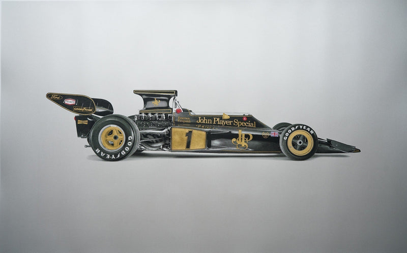
The JPS Lotus F1 cars hands down . Any of them !

Neil Saaty
Neil Saaty
9 years ago
Reply to  Guitar Slinger

JPS Lotus was the first one I thought of, but I figured it didn’t count as it was just one major sponsor. I agree that the 60’s through 80’s produced the best-looking shapes. But just as with road cars, you like best the ones that were current during your impressionable youth.

Jeff H
Jeff H
9 years ago

Benetton 191 7up and Ferrari 642 are my picks for the best looking F1 cars…

Jeff H
Jeff H
9 years ago
Reply to  Jeff H

Oops, I meant Jordan 191 🙂

Guitar Slinger
Guitar Slinger
9 years ago
Reply to  Joel Clark

Errr .. Joel … Seriously ? [ your comment on the shapes of the 80’s era F1 cars ? ] No my young friend . On that comment you are dead wrong in every way shape and form . Fact is the 80’s bodies were the beginning of the end of an era where cars could be distinguished from a half a track away whether liveried or not ! Not to mention the 80’s bringing out levels of engineering and aerodynamic creativity that hardly existed past the early 90’s and has gone the way of the Dodo bird since the 2000’s not to mention some of the most stunning body designs F1 had ever seen . Honestly Joel . On everything else I am more than willing to put any minor differences of opinion we might have down to different strokes for different folks . But on the 80’s comment you are so off base to the point of absurdity

PS; Banging on 60 myself in case you’re thinking the ‘ young friend ‘ comment was in any way intended to be condescending . FYI an F1 fan since 1965 and as the moniker implies an artist myself . Both aural and visual by the way having worked for the likes of Bill Blass etc in and thru out my musical endeavors .

Peter Tabmow
Peter Tabmow
9 years ago

Sorry, I meant the McLaren F1, of course…

Peter Tabmow
Peter Tabmow
9 years ago

Thank you, Guitar Slinger – the Stewart-Ford SF01 was one of several F1 liveries I designed between 1985 and 2005…
Joel, in my opinion there is much earlier and superior example of a visually dramatic F1 car complemented by a livery which exploits the vehicle form to divide the car into distinct sponsor areas: the 1983 Brabham-BMW (below). It has a remarkable pedigree, too: the chassis was designed by Gordon Murray and the livery by Peter Stevens, who of course went on to pen the McLaren M1 together.

Guitar Slinger
Guitar Slinger
9 years ago
Reply to  Peter Tabmow

The 81 Brabham BMW . Yet another brilliant design I forgot to mention … both the livery and the car ! Two thumbs up for the reminder and another two for you having done the SF01 . That was one of the better looking cars of its era !

Nigel Eastmond
Nigel Eastmond
9 years ago

I live Livery. I would livery that MiTo if I got the chance, but for now, I have a very tasty MotoGP replica!

Guitar Slinger
Guitar Slinger
9 years ago

A better looking F1 car ? Heck thats easy . Not to say the FW14B was a bad looking car mind you because it wasn’t . But it was far from the best of the bunch either . For that you’d have to look at say the 1985 Benetton/Sisley Toleman Hart , the Marlboro liveried MP4/6 , the Gitanes sponsored Ligiers , the Prost AP01 , any of the Marlboro liveried Ferrari’s , the aforementioned 7uP Jordan’s as well as the Fly Saudia liveried Williams you make mention of not to mention the Rothmans Williams . As far as race cars in general there’s just too many to mention including all the Martini & Rossi , Alitalia , Rothmans Porsches , the insane Apple sponsored blatantly evil K935RSR etc etc ad infinitum . So though the FW14B was a fine looking albeit in my opinion a bit over badged F1 car it certainly cannot in the overall scheme of things be considered one of the best .

Guitar Slinger
Guitar Slinger
9 years ago
Reply to  Guitar Slinger

… and heck lets not leave out the Stewart SF01 while we’re going down this route .

Keith Walker
Keith Walker
9 years ago

If you are gonna do gaudy, do it right, the B186:

Guitar Slinger
Guitar Slinger
9 years ago
Reply to  Keith Walker

Same thought , different year … two thumbs up

Anders Gullstein
Anders Gullstein
9 years ago

7Up sponsored Jordan 191 and the Renown Mazda 787B pops up as my favorite. Also Martini seldom looks out of place on a race car.

Petrolicious Newsletter