


Alan Fletcher is the Godfather of British Graphic Design
One of the most iconic images to come out of early 1960s British graphic design is a Pirelli bus poster featuring a swerving trail of words left behind by a tire; a playful, elegant and technically difficult production from the genius mind of Alan Fletcher. This Pirelli advertisement, along with countless other works from Fletcher, would go on to revolutionize the British design industry.
Alan Fletcher was born in Kenya in 1931 to a British family and moved to London at the age of five when his father passed away. After World War II, he decided against a mundane middle-class life instead electing a path of creativity, attending the Hammersmith School of Art. His studies eventually landed him a travel scholarship at Yale where he would flourish as a designer, influenced heavily by American art and culture.


During a time when British graphic design was drab and still called ‘commercial art’, Fletcher made headway in the industry with lots of colors, puns, and ingenious ideas. His experiences in America gave him the confidence to take chances and unconventional methods upon his return to London in the early 1960s. He became a consultant for clients like Time, Life, and Pirelli; eventually he formalized his working relationship with friends Bob Gill and Colin Forbes. The result was a number of groundbreaking designs from boutique agency Fletcher/Forbes/Gill, including another Pirelli poster that placed unsuspecting passengers of London’s double-decker buses on top of legs wearing Pirelli slippers.
Many of Fletcher’s designs revolved around the manipulation of fonts, with the logo for news agency Reuters being one of the most famous. It used dots to form letters, giving homage to the holes punched in the ticker tape that was originally used to send news. This logotype, which was created in 1965, remained in use until 1996 when computer screens’ resolution rendered the dots unnoticeable.
Fletcher and his various partners grew the business over the years, expanding their offices to the United States and winning work from high profile clients like Shell, Arthur Andersen, and IBM. But after nearly forty years in the design business, Fletcher became bored of corporate clients and abruptly left the consultancy he founded so many years earlier. He focused on creating personal projects and vowed never to work for uninteresting people.


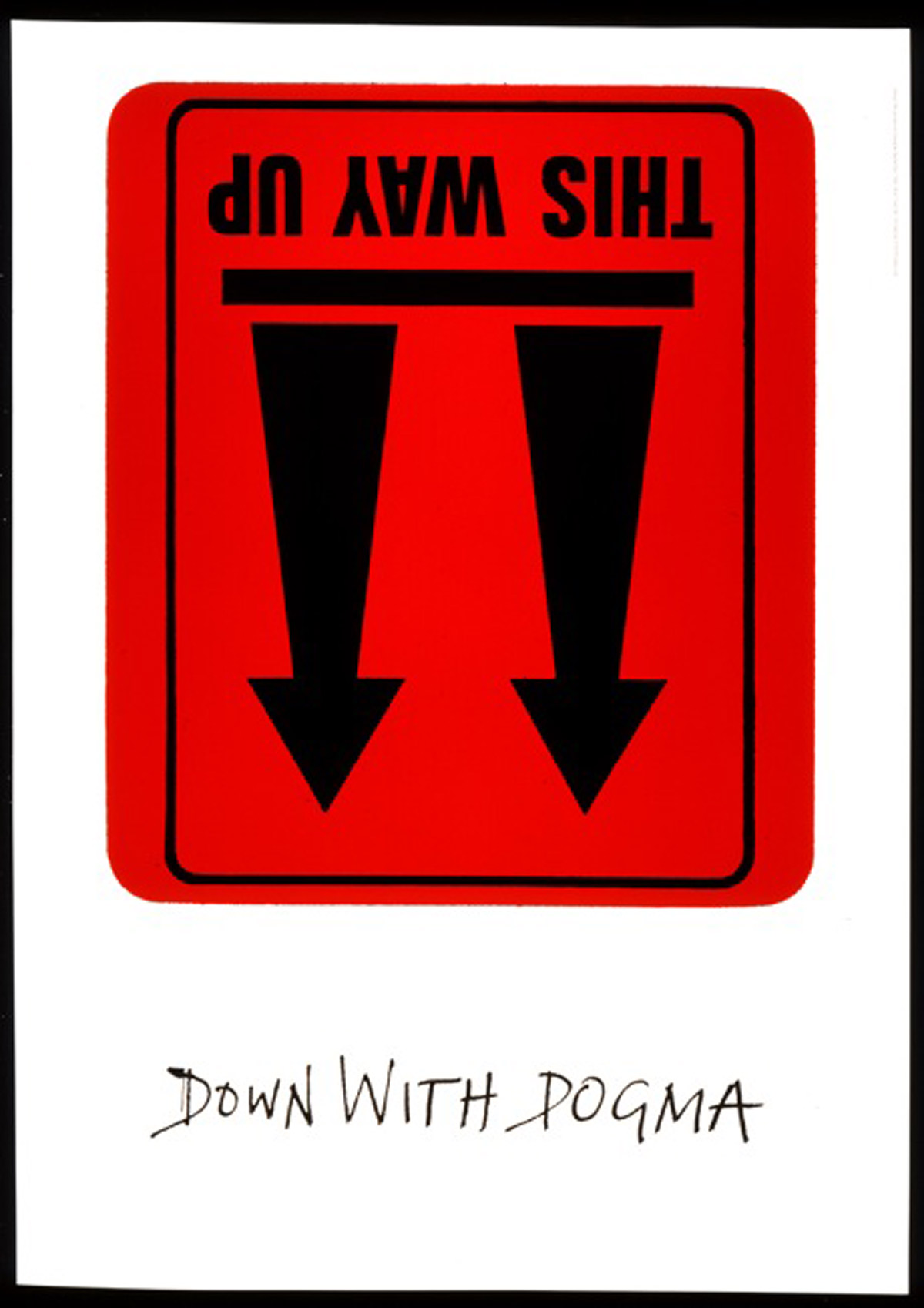
In his later years, Fletcher wrote two books, Beware Wet Paint and The Art of Looking Sideways, both of which received critical acclaim. The books collect a large sample of his work and give a glimpse into his inspiration as well as his love for typeface and its interaction with other design elements.
While Fletcher worked for himself, he served as a consultant art director of Phaidon Press, a cover designer for Domus magazine, and creative advisor to pharmaceutical giant Novartis. His passion would continue to fuel him until his death in 2006.
Alan Fletcher left behind an enormous and influential body of work and many credit him for shaping the face of modern British graphic design.
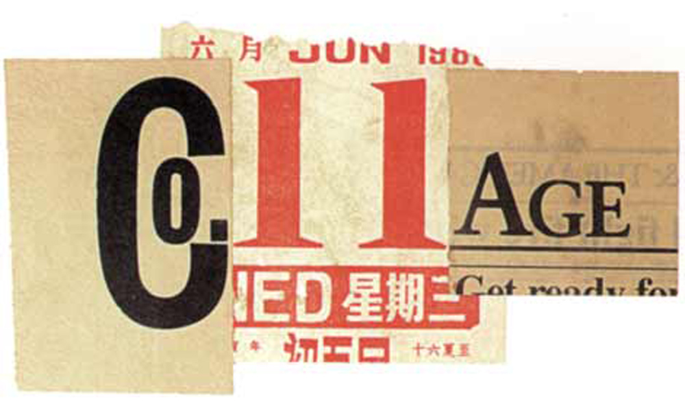


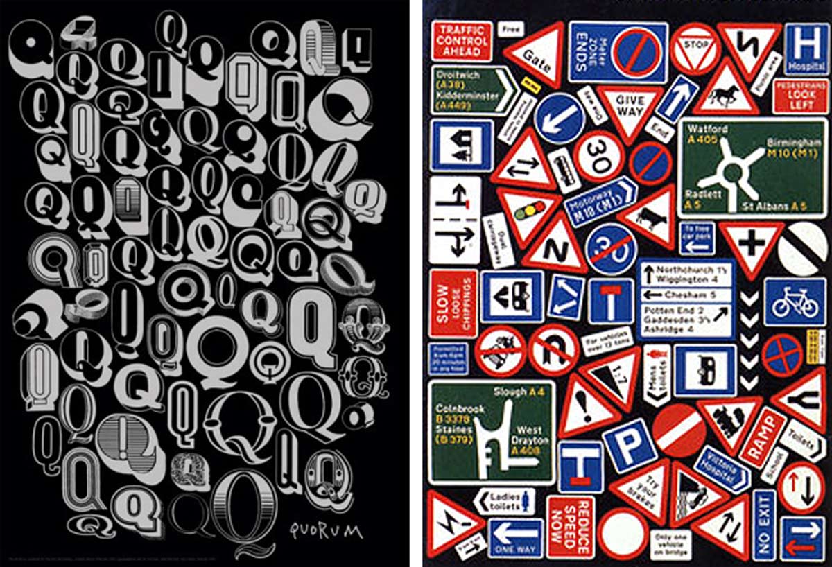
Image Sources: thefoxisblack.com, cloudfront.net, visualizeus.com, quadraforce.com, bossnotboss.com, bossnotboss.com, wordpress.com, pinimg.com, blogspot.com, flickr.com


