


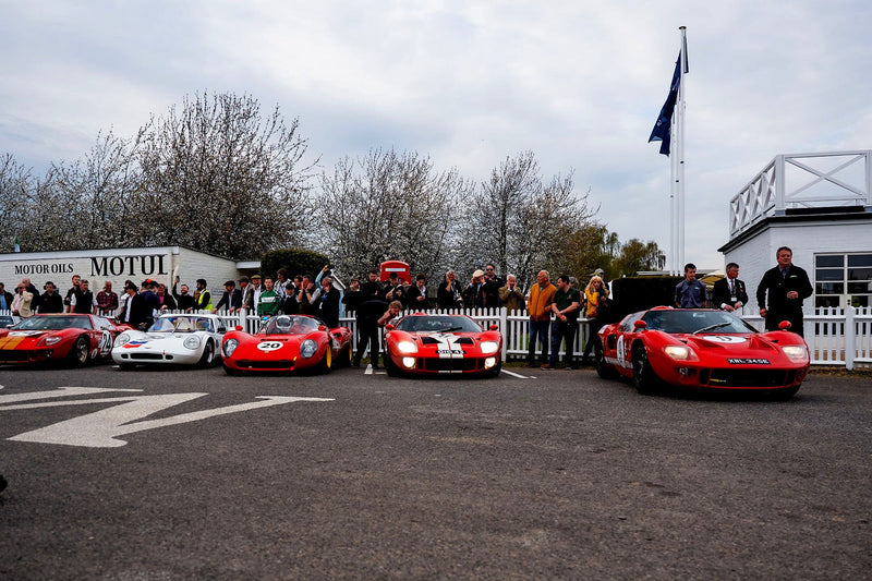
Way back when, one of the only chances to discover some of the amazing racing cars outside of F1 and rallying (at least on TV in the UK), was when I would drag my parents into a local toy shop to gawp at the amazing array of model and remote-controlled cars.
Having travelled to said shops in the back of a Mk1 V6 Capri, I naturally had a huge desire to own one of my own. And what better example than the wild and extravagant Zakspeed Group 5 Fords? From the picture adorning the top of the Tamiya model box, to peering through (at all angles) the plastic window of the toy car packaging, those wild designs captured my imagination like none other. Much to the annoyance of my father, I would pester him to “do-up” his car in the same color schemes (thankfully he didn't take it seriously and instead stuck with the red and obligatory black bonnet scheme on his street-driven Capri). I would then return home to take a paint brush or a set felt tips to my toy cars, trying to replicate the colors and patterns of the famous Würth and Mampe liveries.


I want to stick with these two examples for this installment in my livery series, as these are the designs that have stuck with me since I was a kid. The German race team of Zakspeed certainly has a unique and good-looking stable of cars to their name, and I almost got lost in a sea of slab-sided, block-colored 1980s graphic design.
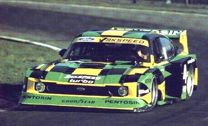
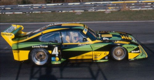
Before doing so, a couple of other cars certainly worthy of a mention are the yellow and green on black design of the Pentosin-sponsored car—this car has ‘pop art’ written all over it. Whichever angle you approach from, there are big geometric masses of solid color overlapping the huge slabs of bodywork, ending up with a look worthy of the title “art car,” in my opinion.


The second honorable mention—and right at the other end of the spectrum—is the Liqui Moly/Nigrin-sponsored car. Although very much from the same camp as the legendary Porsche 917 “Hippie Car,” it does not feel like a poor relative. The Zakspeed Capri was in fact a harder canvas on which to apply those sweeping curves if you think about it; the 917’s is blessed with natural curvaceous lines that serve as a natural home for this look, but getting it to work over the boxed-up bodywork of the Capri shouldn’t have worked as well as it did.


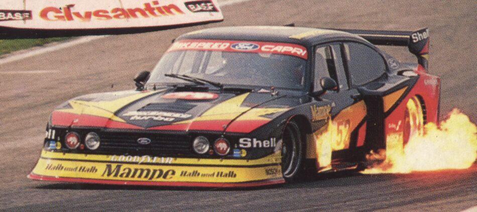
Not being able to pick a single favorite between the Würth and Mampe designs, I have gone with the car’s reputation of being fire-breathing monsters and therefore opted for the red and orange Mampe livery first. If you look at this car with that reputation in mind, the design has the look and feel of a deconstructed ‘70s hot rod, flames of fire sprawling along the bodywork. The slashes and blocks of warm hues that seem to emit from under the hood and side-exit exhausts are a true modernist version of said hot rod paintwork.


This car just spells out danger, yet with all those wings, skirts, and spoilers, there remains a simplistic feel to the overall look. As mentioned in my previous article on the Team Classic Suzuki livery, it all has a feel of being fairly simple. It’s amazing how just a few somewhat random-looking shapes in only two colors manage to draw ones eye from top to bottom and front to back with a natural flow.
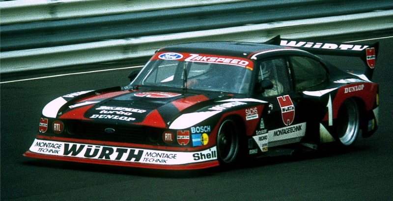
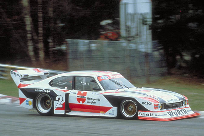
Perhaps the most recognizable example of the Capri though though must be the aforementioned Würth cars. This is another perfect example of demonstrating how something shouldn’t work, but does anyway, and succeeds greatly. The design is an amalgamation of red and black diagonal shapes that look as though they have been added just to break up the vast expanses of white (or black) bodywork with no consideration to the shape of the car itself. Consisting of triangles, various stripes, and tilted rectangles, the placement of these elements again venture into the world of the art car… or dare I say “abstract art car,” as this abstraction of the Würth branding is as radical as the canvas itself. Speaking of canvases, one of the first livery-based artworks I created was based on creating a version of this car.


Much like the Mampe livery, the designers have accomplished everything with only two colors on top of the base; it’s like hearing a band that creates a huge sound with just two or three members. Think of this as the White Stripes of car liveries!
While writing and researching this article, my desire for a Tamiya 1/24th Zakspeed Capri model kit has been totally reignited. If you have one, let me know, otherwise I’ll probably just dig out my old toy cars and felt tips again.
Image sources: 1, 2, 3, 4, 5, 6, 7, 8, 9, 10, 11, 12, 13, 14, 15, 16, 17, 18


