


Of all the articles, blogs, forums, and features on iconic motorsport liveries over the years, none have ever included, or really mentioned Ferrari. “But they’re always the same, just painted Ferrari Red,” I hear you say, and you’d be right, however when you start looking back and trawling through Google image search results…you begin notice it’s not always quite that simple.

This article is for all the Ferrari fans out there—of which almost every petrolhead is: your big, red, shiny Christmases have come all at once. But how does one go about writing 100s of words on an iconic racing livery that is usually the same?
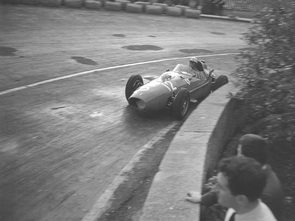
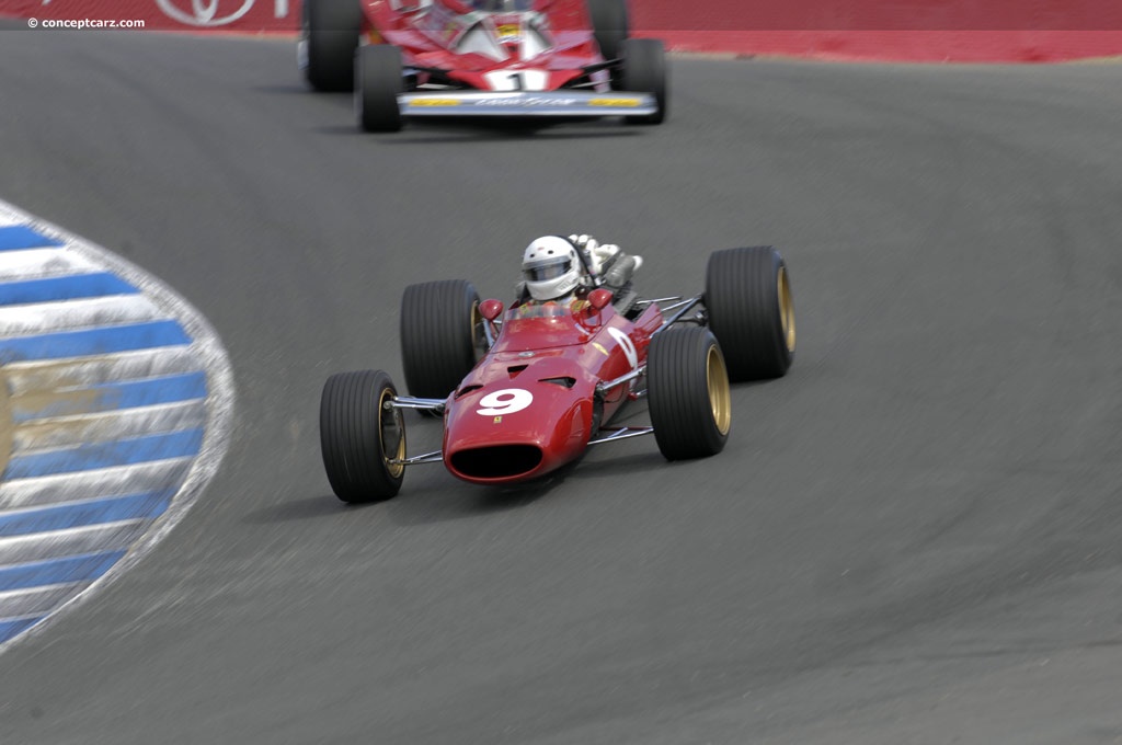
Red is the national racing color of Italy, and this dates back to the 1900s—it is worth noting, though, that up until 1907, it was the USA that initially raced in red. It wasn’t until the interwar period that Grand Prix racing officially adopted the colors we now associate with each country.Rosso Corsa was the company’s designated shade of red, and this stayed true right up until 1995; I’ve spoken before about the values of longevity in a brand and you can’t really top that.

Ferrari’s first sponsor, Shell, only stuck a small logo on what was still just a red Ferrari. Luckily, it happened to be Shell, as the red and yellow logo looked totally at home along with Ferrari’s own badge, and therefore no doubt kept thetifosi happy by not having their beloved cars look like advertising hoardings—as was much the response when sponsorship was introduced into Formula 1. This means that to find great examples somewhat depends on whoever the lead sponsor was, and how little of the original Ferrari red they encroached on. Maybe the only debate on Ferrari racing liveries is which was the best shade of red!
As I’ve already mentioned, Rosso Corsa ran all the way up until 1995, but changed to Marlboro Red for the start of the 1996 season. This caused outrage at the time with the Ferrari faithful, and continues to aggravate some devout fans to this day. If the idea that Ferrari changed its historic color to that of a sponsor wasn’t enough, in 2007 it changed again to a new shade of red called Rosso Scuderia. For reasons unbeknown to many, the change came about after the decision was made that the original Rosso Corsa was deemed too dark—or muddy, as they put it—when seen on TV. So to suit the advances in broadcast quality, this new lighter, brighter shade was adopted.

In fairness, it does help the cars look better, and with racing liveries becoming ever more complex, the lines of the car may not have sat so well on the original, darker tone. The fact that it’s the sponsor’s exact color should only ever be whispered. Less we forget how dated colors actually become, aside from the obvious browns, beiges and purples of the ’70s, I’m always amazed at how different a restomodded vehicle looks when repainted in a contemporary color option. It becomes, in many cases, the icing on the cake to create that perfect blend of old and new. While mentioning contemporary colors, there was one other change to come from Ferrari, and that was to Nouvo Rosso Scuderia, a pearlescent.
Now we’ve cleared all that up, we can concentrate on a few of the finest examples. Without Googling it, the first few cars that come to mind for me are the 1977 312 T2. Apart from it being a flat-12 engine (oh the noise!), the inclusion of thetricolore stripes, silver wings, and bursts of white really helped to bring all the sponsor stickers together in what looks like a considered racing livery. I can’t help feeling this conclusion is based somewhat on nostalgia, for when you begin to dissect the design, it basically looks like someone didn’t order all the stickers and had to spread them out a bit! But this hopefully proves my point, for it’s still a red Ferrari.

The 1980 cars of Villeneuve and Scheckter are also a long standing favourite of mine, probably because the poster of it sat alongside my Countach one on my bedroom wall, but the shape of that car alone meant it didn’t need much in the way of graphic design. Plus, the continuation of the unpainted alloy wings helped to mark out these cars as instantly memorable breeds from the Ferrari stable.
I must, of course, speak of the non-red cars, even though these pre-date the introduction of sponsorship liveries. A Belgian entry, driven in the 1961 Belgian Grand Prix in the hands of Belgian driver Olivier Gendebien appeared in yellow—which is the second-best color for a Ferrari—but totally off-piste was when John Surtees won the the 1964 World Title in a white and blue Ferrari of the North American Racing Team. This arrangement was only for the U.S. Grand Prix, a result of the usual crazy politics within F1.
Forget the festive red of Santa Claus, Rudolph’s nose, and the Coca-Cola truck, and for the holidays this year, consider feasting more heavily on Ferrari red.


Image sources: tumblr.com, theselvedgeyard.com, wallpaperup.com, jalopnik.com, conceptcarz.com, ultimatecarpage.com, flickr.com, deviantart.net, wikimedia.org, petrolicious.com
This article is for all the Ferrari fans out there—of which almost every petrolhead is: your big, red, shiny Christmases have come all at once. But how does one go about writing 100s of words on an iconic racing livery that is usually the same?
Red is the national racing color of Italy, and this dates back to the 1900s—it is worth noting, though, that up until 1907, it was the USA that initially raced in red. It wasn’t until the interwar period that Grand Prix racing officially adopted the colors we now associate with each country.Rosso Corsa was the company’s designated shade of red, and this stayed true right up until 1995; I’ve spoken before about the values of longevity in a brand and you can’t really top that.
Ferrari’s first sponsor, Shell, only stuck a small logo on what was still just a red Ferrari. Luckily, it happened to be Shell, as the red and yellow logo looked totally at home along with Ferrari’s own badge, and therefore no doubt kept thetifosi happy by not having their beloved cars look like advertising hoardings—as was much the response when sponsorship was introduced into Formula 1. This means that to find great examples somewhat depends on whoever the lead sponsor was, and how little of the original Ferrari red they encroached on. Maybe the only debate on Ferrari racing liveries is which was the best shade of red!
As I’ve already mentioned, Rosso Corsa ran all the way up until 1995, but changed to Marlboro Red for the start of the 1996 season. This caused outrage at the time with the Ferrari faithful, and continues to aggravate some devout fans to this day. If the idea that Ferrari changed its historic color to that of a sponsor wasn’t enough, in 2007 it changed again to a new shade of red called Rosso Scuderia. For reasons unbeknown to many, the change came about after the decision was made that the original Rosso Corsa was deemed too dark—or muddy, as they put it—when seen on TV. So to suit the advances in broadcast quality, this new lighter, brighter shade was adopted.
In fairness, it does help the cars look better, and with racing liveries becoming ever more complex, the lines of the car may not have sat so well on the original, darker tone. The fact that it’s the sponsor’s exact color should only ever be whispered. Less we forget how dated colors actually become, aside from the obvious browns, beiges and purples of the ’70s, I’m always amazed at how different a restomodded vehicle looks when repainted in a contemporary color option. It becomes, in many cases, the icing on the cake to create that perfect blend of old and new. While mentioning contemporary colors, there was one other change to come from Ferrari, and that was to Nouvo Rosso Scuderia, a pearlescent.
Now we’ve cleared all that up, we can concentrate on a few of the finest examples. Without Googling it, the first few cars that come to mind for me are the 1977 312 T2. Apart from it being a flat-12 engine (oh the noise!), the inclusion of thetricolore stripes, silver wings, and bursts of white really helped to bring all the sponsor stickers together in what looks like a considered racing livery. I can’t help feeling this conclusion is based somewhat on nostalgia, for when you begin to dissect the design, it basically looks like someone didn’t order all the stickers and had to spread them out a bit! But this hopefully proves my point, for it’s still a red Ferrari.
The 1980 cars of Villeneuve and Scheckter are also a long standing favourite of mine, probably because the poster of it sat alongside my Countach one on my bedroom wall, but the shape of that car alone meant it didn’t need much in the way of graphic design. Plus, the continuation of the unpainted alloy wings helped to mark out these cars as instantly memorable breeds from the Ferrari stable.
I must, of course, speak of the non-red cars, even though these pre-date the introduction of sponsorship liveries. A Belgian entry, driven in the 1961 Belgian Grand Prix in the hands of Belgian driver Olivier Gendebien appeared in yellow—which is the second-best color for a Ferrari—but totally off-piste was when John Surtees won the the 1964 World Title in a white and blue Ferrari of the North American Racing Team. This arrangement was only for the U.S. Grand Prix, a result of the usual crazy politics within F1.
Forget the festive red of Santa Claus, Rudolph’s nose, and the Coca-Cola truck, and for the holidays this year, consider feasting more heavily on Ferrari red.
Image sources: tumblr.com, theselvedgeyard.com, wallpaperup.com, jalopnik.com, conceptcarz.com, ultimatecarpage.com, flickr.com, deviantart.net, wikimedia.org, petrolicious.com


