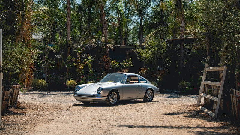
I’ve recently moved into a new artist studio and lucky enough, I share the space with a couple of other “petrolheads”. Here, among the array of old-stock race team merchandise, an eclectic mix of Formula 1 wheels and half of Caterham F1’s pit garage internals, there’s a mysterious—albeit very well-used and battered—bit of bodywork from a McLaren Cam-Am racing car.
The graphics on it are all hand-signwritten, and it got me thinking about the livery designs of the legendary race series of the late ’60s to early ’70s. I’ve always been aware of McLaren’s ‘M8’ series of Can-Am cars flashing around a track their sunburst orange outfits (still one of the first cars I remembering hearing a good while before seeing) but as for the rest of the series, I was never really that knowledgeable about what the cars looked like.

Here we have—at first glance—wonderfully bright, bold and exciting colours; each Can-Am car filling our retina with massive globs of colour, but, I can’t help feeling they could have been so much more.
The original Can-Am series is, and always likely to be, the most open race series we’ve ever seen. The series was virtually unrestricted on everything from unlimited engine sizes, power output, any kind of aero package—and your choice of turbos and superchargers! The rest of the rulebook was equally free; it required cars to have two seats, bodywork enclosing the wheels, and basic safety.
With such openness and abandonment, why didn’t the liveries follow suit? If everyone had an ideal canvas to go equally as nuts, then this was surely it.
The series’ early cars looked like real life ‘cartoon’ racing cars—I mean this as a compliment—because as a kid first setting eyes on them; they looked as though my ideal toy car had come to life. Luckily there are a few examples where the team did approach the livery with equal freedom. Some do: the 1972 Steve Durst McLaren M8D is a car that screams with all the American-brashness this race series deserves. Its light-to-dark blue livery verges on the custom car scene of that era, with different tones accentuating various shapes and parts of the bodywork.

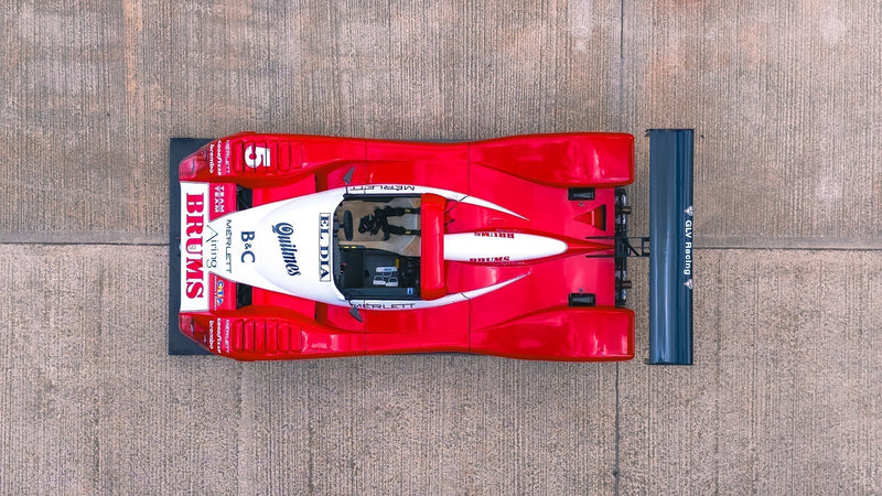
Another notable livery is the often over-looked Porsche 917—could there be such a thing, you ask?
Well, yes; the 1,500+ horsepower, superhero-speed 1973 Sunoco Porsche 917/30 doesn’t look like the Gulf-liveried 917 racers most people know fromLe Mans . Again, I find elements of ’70s custom paint jobs in there, plus ever-satisfying ‘phat stripes’ that drape over its flowing bodywork. Like many of the Can-Am cars, the 917/30 lived-on as the basis for F5000 and second-generation Can-Am cars. It’s only when you look to European race series—most notably Group 7—that we see the usual ilk of big name sponsors like Martini all over top-level race cars…but that’s another story altogether.
For what was such a popular and spectacular race series in Can-Am racing, one that featured many big-name drivers and healthy prize money, there is a distinct lack of livery-altering sponsors. I don’t know if this had anything to do with Johnson Wax, the company that originally supported the series, but it does surprise me to see the cars so unadorned by sponsorship logos.

The series finally came to an end in 1974 after a couple of fairly dismal seasons and the exodus of its top drivers to F5000, plus there was the problem of dominant cars often walking away with multiple wins on the trot. The noise and spectacle were worth it, and Can-Am returned in ’77 after merging with F5000—but many of the cars grew into ugly ducklings, until a similar demise in 1987.
I’m probably over-thinking it, though. In my research, I came across a promotional shot for Can-Am slot-car toys. To see them all lined up, like a ’70s Pantone colour guide, immediately took me back to what captured my imagination with Can-Am in the first place: they’re big, flame-spitting wedges in primary colors—not unlike what you’d see at the local horse track.
When the noise and spectacle are so good, who needs to stare at flashy liveries?


Photos courtesy of McLaren (Robert Bohl) & Porsche
The graphics on it are all hand-signwritten, and it got me thinking about the livery designs of the legendary race series of the late ’60s to early ’70s. I’ve always been aware of McLaren’s ‘M8’ series of Can-Am cars flashing around a track their sunburst orange outfits (still one of the first cars I remembering hearing a good while before seeing) but as for the rest of the series, I was never really that knowledgeable about what the cars looked like.
Here we have—at first glance—wonderfully bright, bold and exciting colours; each Can-Am car filling our retina with massive globs of colour, but, I can’t help feeling they could have been so much more.
The original Can-Am series is, and always likely to be, the most open race series we’ve ever seen. The series was virtually unrestricted on everything from unlimited engine sizes, power output, any kind of aero package—and your choice of turbos and superchargers! The rest of the rulebook was equally free; it required cars to have two seats, bodywork enclosing the wheels, and basic safety.
With such openness and abandonment, why didn’t the liveries follow suit? If everyone had an ideal canvas to go equally as nuts, then this was surely it.
The series’ early cars looked like real life ‘cartoon’ racing cars—I mean this as a compliment—because as a kid first setting eyes on them; they looked as though my ideal toy car had come to life. Luckily there are a few examples where the team did approach the livery with equal freedom. Some do: the 1972 Steve Durst McLaren M8D is a car that screams with all the American-brashness this race series deserves. Its light-to-dark blue livery verges on the custom car scene of that era, with different tones accentuating various shapes and parts of the bodywork.
Another notable livery is the often over-looked Porsche 917—could there be such a thing, you ask?
Well, yes; the 1,500+ horsepower, superhero-speed 1973 Sunoco Porsche 917/30 doesn’t look like the Gulf-liveried 917 racers most people know fromLe Mans . Again, I find elements of ’70s custom paint jobs in there, plus ever-satisfying ‘phat stripes’ that drape over its flowing bodywork. Like many of the Can-Am cars, the 917/30 lived-on as the basis for F5000 and second-generation Can-Am cars. It’s only when you look to European race series—most notably Group 7—that we see the usual ilk of big name sponsors like Martini all over top-level race cars…but that’s another story altogether.
For what was such a popular and spectacular race series in Can-Am racing, one that featured many big-name drivers and healthy prize money, there is a distinct lack of livery-altering sponsors. I don’t know if this had anything to do with Johnson Wax, the company that originally supported the series, but it does surprise me to see the cars so unadorned by sponsorship logos.
The series finally came to an end in 1974 after a couple of fairly dismal seasons and the exodus of its top drivers to F5000, plus there was the problem of dominant cars often walking away with multiple wins on the trot. The noise and spectacle were worth it, and Can-Am returned in ’77 after merging with F5000—but many of the cars grew into ugly ducklings, until a similar demise in 1987.
I’m probably over-thinking it, though. In my research, I came across a promotional shot for Can-Am slot-car toys. To see them all lined up, like a ’70s Pantone colour guide, immediately took me back to what captured my imagination with Can-Am in the first place: they’re big, flame-spitting wedges in primary colors—not unlike what you’d see at the local horse track.
When the noise and spectacle are so good, who needs to stare at flashy liveries?
Photos courtesy of McLaren (Robert Bohl) & Porsche