Before we really begin, I must confess that I dislike the Ferrari Testarossa’s form. Styling is always subjective and this is one car that is just far too exaggerated for me. I won't use the term “cheese grater” in this article, however, and recognize that the Testarossa’s absurd cues have helped it reach its iconic status. And while I may not like the shape, it is a successful design and that is something that everybody, whether they enjoy the design or not, must respect.
The Ferrari Testarossa was the Berlinetta Boxer 512’s successor, designed to address the BB’s shortcomings. The Boxer had a central, front-mounted radiator that was plumbed through the cockpit to the mid-mounted engine, which resulted in a continuously hot cabin. When the Testarossa’s development began, Pininfarina explored options to remedy this situation, eventually deciding to split the radiator in two and move it amidships.
Not only did this lower cabin temperatures (and increase front luggage space), but it also allowed designers to experiment with the modified mid-engined proportions that it’s now so famous for. Considered in any view except pure side, the width that the side radiators necessitate communicate the Ferrari’s power very convincingly. However, it does still have a mid-engined proportion (as it should).

The gesture or theme of the car can be described in two strokes: first, the sweep of the rear fender beginning at the front bumper cut-line and second, the hood leading into the fast windshield rising over the large, open greenhouse. Perhaps most surprising is that the front overhang is so long. This was a concession to better front luggage space (another issue owners had with the BB). The large front overhang, along with the square, flat back conspire to make the Ferrari seem large for a sports car; however, the boxer-12 (low center of gravity) and aforementioned large greenhouse are what make the Testarossa such a good car to drive.
With regard to surfacing, Ferrari didn’t break much new ground on this car. There is a clear evolution from the BB 512. But it is important to note that in pure side view, the curve that forms the top of the rear fender also communicates the Ferrari’s power as it sweeps up from the front wheel.
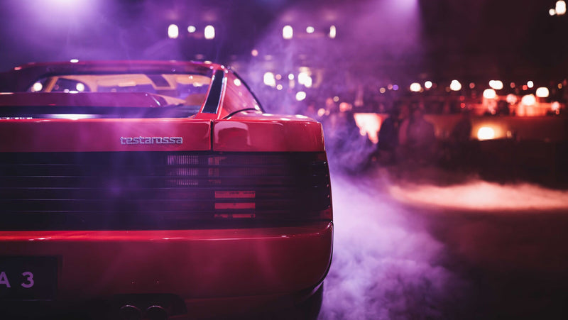
Details are largely sparse as was the style in the 1980s with most trim painted in body color. Perhaps the best details are the horizontal slats that span the Testrossa’s rear accentuating what is already an exceptionally wide backside. Sir-Mix-a-Lot would approve (and did, he owned a black 1987 Testarossa). In fact, the rear view is probably the Ferrari’s best angle, which is fortunate because it’s the one most people will probably see on the road.
Hopefully, you can tell that this article is winding down and yet we haven’t covered the elephant in the room, the symbol of the Testarossa’s essence: those side strakes. The original design called for the ducts to be large and open. You can imagine the designers, leaning over sketches and clay, lit cigarette in one hand, thinking, “bigger. More open, more air!” as if designing the intakes for an F-14 Tomcat. Unfortunately, or fortunately depending on your perspective, the strakes were required because laws in several countries prevented such large openings.
The strakes are what helped to elevate the Testarossa to iconic status. But they also cause it to look cartoonish. As explained earlier, the car’s design is successful because it improved on its predecessor’s shortcomings and also stands on its own. It has a clear theme and communicates its purpose honestly. There is beauty in that but it also happens to look like an eighth-grader’s study hall sketch, and that, to me, is not beautiful. By the way: cheese grater. Sue me.


