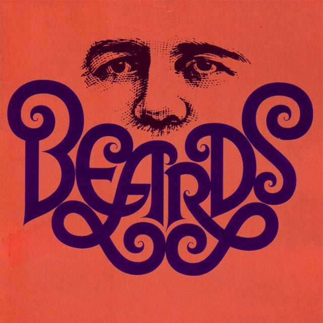
Called one of the original Mad Men by some, graphic designer Herb Lubalin is a giant of American design and typography. Following his education at New York’s Cooper Union, he went to work in advertising and enjoyed an extremely successful career as an art director for over twenty years, until he left to start his own shop.
Managing his own business allowed him the freedom to focus on a broad cross-section of projects from magazines and posters to packaging design. It was a way for him to use typography, which he saw as away to communicate more than words themselves. According to the American Institute of Graphic Arts (AIGA), “Lubalin helped push back the boundaries of the impact and perception of design—from an ill-defined, narrowly recognized craft to a powerful communication medium that could put big, important ideas smack in the public eye.”


Starting his own company also led to his collaboration with Mr. Ralph Ginsburg on a series of magazines (Eros, Fact, and Avant Garde) each seemingly more controversial (and more well-renowned) than the preceding one due to nudity and issues stemming from “taste”.
There seems to have been a backlash against him in the 1980s however as the typeface he created for Avant Garde magazine (ITC Avant Garde) was in such demand and so overused by people who didn’t understand it and consequently misused it, that it became a cliché of the 1970s. However, it’s only with hindsight that we can see just how misunderstood the font was and how sublime a typographer Lubalin really was.
But he would bristle at the use of that word. Lubalin said, “What I do is not really typography, which I think of as an essentially mechanical means of putting characters down on a page. It's designing with letters. Mr. Aaron Burns called it, 'typographics,' and since you've got to put a name on things to make them memorable, 'typographics' is as good a name for what I do as any.”


Indeed, he didn’t create eye-catching layouts simply by dropping blocks into a press. He designed the letters individually and had a playful approach to design, marveling at how letters’ shapes changed the weight and meaning of words. The AIGA explains, “(I)t is Lubalin and his typographics—words, letters, pieces of letters, additions to letters, connections and combinations, and virtuoso manipulation of letters—to which all must return.”
Like most great designers, Lubalin experimented with his work throughout his life and having reached a very high level of success, was astute enough to recognize his luck, “Right now, I have what every designer wants and few have the good fortune to achieve. I'm my own client. Nobody tells me what to do.” He truly evolved with the times and like the 1960s and ‘70s during which his fame peaked, he was as idealistic and anti-establishment as hippies in the Haight. He died, aged sixty-three, in 1981 perhaps sparing him the cynicism of the new decade.
Please note that the ad for the Audi Fox is not by Mr. Lubalin, rather it is inspired by his style and type treatments.


Image Sources: thefoxisblack.com, cloudfront.net, visualizeus.com, quadraforce.com, bossnotboss.com, bossnotboss.com, wordpress.com, pinimg.com, blogspot.com, flickr.com


