Journal: How An Artist went from Sketching to Professional Car Styling

How An Artist went from Sketching to Professional Car Styling

By Andrew Schneider
September 3, 2013

Philip Mason is a talented artist from Ann Arbor, Michigan. He grew up painting, drawing, and sketching, and got his first freelance job when he was in eighth grade for a regionally acclaimed comic book. He went on to do more commissions and win local awards before heading off to college. At the urging of his parents, he began studying engineering rather than his true passion. After a few years, Mason came across a Japanese car styling magazine, and had an epiphany that this occupation was his true calling. He immediately enrolled at College for Creative Studies in Detroit and was hired at Ford Motor Company as a car stylist upon graduation, being only one of three students in the program to get a job directly out of college. 

Being part of the Ford Motor Company Design Staff for over twelve years was a dream for Mason. When the economy took a turn for the worst and the business of automotive design shifted, he left to join the “dot-com” boom as well as work as an adjunct professor at CCS, where he had studied years earlier. He promised himself at this time that at the age of 45 he would retire and spend the rest of his life painting. We’re grateful for this, because we are able to enjoy the beautiful watercolors Mason creates.

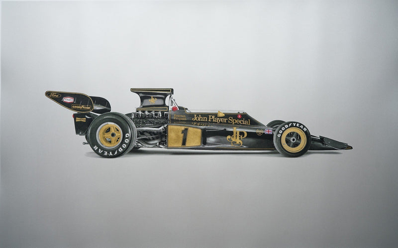
In his automotive painting, Mason frames his Formula 1 subjects tightly, filling the frames with the cars. This helps us to focus on the scenes and parts that Mason himself finds the most intriguing. 

Which painting is your favorite?

Click here to view Philip Mason’s portfolio.
Click here to contact Mason.
Join the Conversation
0 0 votes
Article Rating
Subscribe
Notify of
0 Comments
Inline Feedbacks
View all comments
Philip Mason
Philip Mason
11 years ago

Thank you all so very much for the kind words and comments. I’ve begun a new round of pieces for the end of the year and will post on my website before Christmas. If you have a favorite racer/car please let me know and I’ll probably paint it the beginning of the new year. Please feel free to contact me with requests or commissions. Take care!

Deep Deo
Deep Deo
11 years ago

I’m not a douchebag I swear…

Ray Beltran
Ray Beltran
11 years ago
Reply to  Deep Deo

It’s a free country; speak your mind.

Deep Deo
Deep Deo
11 years ago

Maybe its just me, but doesn’t it always seem that scale and proportion are always a bit off when an artist chooses this medium? I love the Jimmy Clark piece here, use of colour and style points are huge… but seeing the lack of symmetry and fluidity of motion in the car bugs me a bit. Specifically, the front suspension looks wrong considering the near-3/4 viewing angle (the control arms on right side of the car should appear shorter than the left,) the front of the car pointed a bit down and right when the sense of motion is trying to convey speed down a straightaway and the negative space should represent a change in light, as in reflection vs shadow/colour, whereas it shows reflections on both sides of the car here.

Seems a bit off to my eye. Jus sayin’.

Ray Beltran
Ray Beltran
11 years ago
Reply to  Deep Deo

Well, certainly there are inaccuracies. Look at the differences between tires/bodywork on either side of Mario’s Lola. Even Senna’s suspension lengths seems to be a bit off. But I think the overall impression he’s trying to convey is very well done.

Working with watercolor is something that has eluded me for years. This medium is very hard to control (for me) and I envy people who display a level of control with it while still communicating their inspiration through it. Perhaps that’s one reason why I tend not to focus on the inaccuracies in this case.

There were several motorsport artists in the late 70’s, early 80’s who, in my opinion, threw color on a board or canvas. Static and dull, lacking passion, they took advantage of the interest in all things speed, and saw an opportunity to make some $. That’s the message I got when I considered their work.

Mr. Mason’s work, although not perfect, is SO much closer to what I think of when I consider the attributes associated with this beautiful sport – color, flow, intensity, energy.

I love it.

Ray Beltran
Ray Beltran
11 years ago

Beautiful work. Like his choice of medium – seemingly uncontrollable fluidity of watercolor. The benign nature of it set to speed. The purity of allowing the board to be seen, the addition of color by the absence of it.

Christopher Gay
Christopher Gay
11 years ago

Very, very nice work.
If I were forced to choose one, I would lean for the Jimmy Clark #5.
They all ring true to me, so it is a tough call. They would all shine in my studio or in my son’s room.
Thanks for sharing.

Petrolicious Newsletter