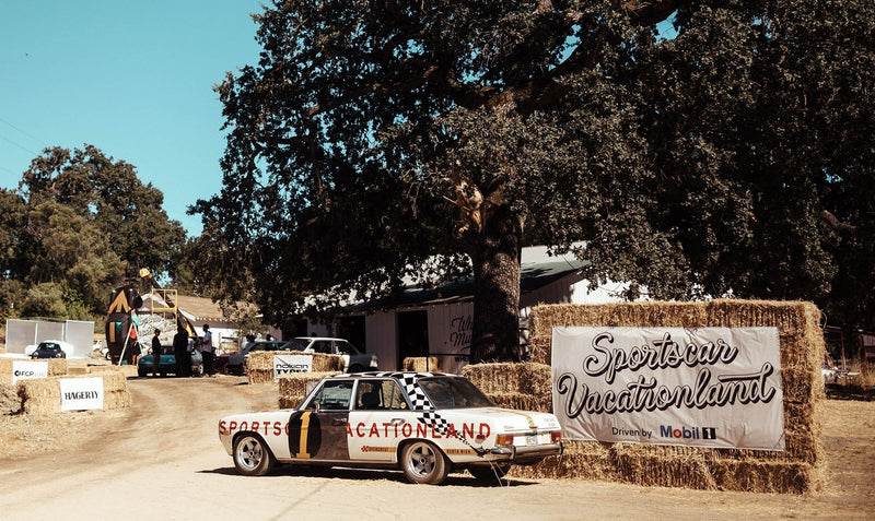
Editor’s note: This article originally appeared on June 22, 2015, every week we'll be diving into our archives to bring you some of the gold you might have missed. Photos by Michael Banovsky & Laurent Nivalle
I’ve long had an interest in typography, and while I’m no type designer or expert in the matter, local car shows are often a chance for me to capture chrome script or a fetching period decal that features compelling typography.
The best part? Even the smallest of car shows often have a detail or two that begs for attention.


Often, Mopars (Dodge, Chrysler, Plymouth, DeSoto, and Jeep) models from years gone by provide my favorite type seen on American cars, simply because many of the desirable trim levels had hilarious names, like the Dart “Swinger”. Moreover, the company often presented its performance cars in very bright hues—like this Charger in Sassy Grass Green. With that chrome script font, black vinyl top, and lime green paint, is there a more ‘60s color combination?

Laurent Nivalle captured “Mustang”, presented—as many ’60s cars were—in chrome script font. But when you look at its blocky and bold BF Goodrich tire behind, the idea of high performance is implied simply by the bold white lettering.


You’d never see either of these fonts today on a car, actually, a few years ago, Chevrolet asked its employees to stop referring to thecompany as “Chevy” . Italian for “fly”, the jaunty, playful Volaré script is balanced perfectly by this it-could-be-your-dad’s-desk-plaquard “Premier” in gold, a very ’70s trim level on this very ’70s car.


Notice how differently companies illustrate trademarks; on the left, the very Mad Men-esque script font seen on the 1960 model eventually gave way to simple sans-serif lettering as the Ford Sunliner marched into the mid-to-late ’60s. On the right, for the owner who opens his hood at a car show, there’s no way to miss what’s under the hood with its unnecessarily red air cleaner and very bold serif font in all-caps…rendered with a shiny chromed sticker.


Designers were never shy about shouting a car’s name, and on my favorite years of Plymouth Barracuda, that meant a rear badge about a foot across! In contrast, European marques, typified by Volvo, were often satisfied with small, understated badges like this one, with embellishments long lost to time—Volvo’s hometown of Gothenburg was so-named forGöta borg , or “Gothia Fortress”, referenced by the trio of styled turrets at the top of the badge.


We may laugh today, but multiple badges with conflicting styles were often present on vehicles. Here, seen on the nose of a truck, the old “Ford” font sits above the gear-and-bolt logo the company added to its trucks. Below that, the “Fordomatic” badge that was found across Ford’s model range of both cars and trucks. Finally, the iconic and wide “V8” badge that hints at the power within. On the side of the truck, however, it all gets unexpectedly mid-century modern, doesn’t it? What a stunning shape.
With this said, what are some of your favorite badges seen on classics—and do you love exploring vintage type at car shows as much as I do?
I’ve long had an interest in typography, and while I’m no type designer or expert in the matter, local car shows are often a chance for me to capture chrome script or a fetching period decal that features compelling typography.
The best part? Even the smallest of car shows often have a detail or two that begs for attention.
Often, Mopars (Dodge, Chrysler, Plymouth, DeSoto, and Jeep) models from years gone by provide my favorite type seen on American cars, simply because many of the desirable trim levels had hilarious names, like the Dart “Swinger”. Moreover, the company often presented its performance cars in very bright hues—like this Charger in Sassy Grass Green. With that chrome script font, black vinyl top, and lime green paint, is there a more ‘60s color combination?
Laurent Nivalle captured “Mustang”, presented—as many ’60s cars were—in chrome script font. But when you look at its blocky and bold BF Goodrich tire behind, the idea of high performance is implied simply by the bold white lettering.
You’d never see either of these fonts today on a car, actually, a few years ago, Chevrolet asked its employees to stop referring to thecompany as “Chevy” . Italian for “fly”, the jaunty, playful Volaré script is balanced perfectly by this it-could-be-your-dad’s-desk-plaquard “Premier” in gold, a very ’70s trim level on this very ’70s car.
Notice how differently companies illustrate trademarks; on the left, the very Mad Men-esque script font seen on the 1960 model eventually gave way to simple sans-serif lettering as the Ford Sunliner marched into the mid-to-late ’60s. On the right, for the owner who opens his hood at a car show, there’s no way to miss what’s under the hood with its unnecessarily red air cleaner and very bold serif font in all-caps…rendered with a shiny chromed sticker.
Designers were never shy about shouting a car’s name, and on my favorite years of Plymouth Barracuda, that meant a rear badge about a foot across! In contrast, European marques, typified by Volvo, were often satisfied with small, understated badges like this one, with embellishments long lost to time—Volvo’s hometown of Gothenburg was so-named forGöta borg , or “Gothia Fortress”, referenced by the trio of styled turrets at the top of the badge.
We may laugh today, but multiple badges with conflicting styles were often present on vehicles. Here, seen on the nose of a truck, the old “Ford” font sits above the gear-and-bolt logo the company added to its trucks. Below that, the “Fordomatic” badge that was found across Ford’s model range of both cars and trucks. Finally, the iconic and wide “V8” badge that hints at the power within. On the side of the truck, however, it all gets unexpectedly mid-century modern, doesn’t it? What a stunning shape.
With this said, what are some of your favorite badges seen on classics—and do you love exploring vintage type at car shows as much as I do?