Julian Thomson is devoted to making cars look good. Whether this manifests in the latest crop of cats from Jaguar (Thomson is Jaguar’s Director of Advanced Design) or in his series of vintage-aspired artwork, every aesthetic path he takes yields something special for his efforts. As a student, he focused on vehicle design at the Royal College of Art, and since graduating he’s been involved with design teams at manufacturers like Ford, VW, Audi, and Lotus. Since 2010 he’s been part of the guiding force behind Jaguar Land Rover’s production and concept vehicles along with design director Ian Callum.
Thomson is a well-regarded designer in the international community, but his legacy will surely rest on his contributions to the British motoring world in particular. He is perhaps best known for designing the first generation of the Lotus Elise, and though it’s hard to top that in terms of popularity, his less-prominent work deserves your attention too.


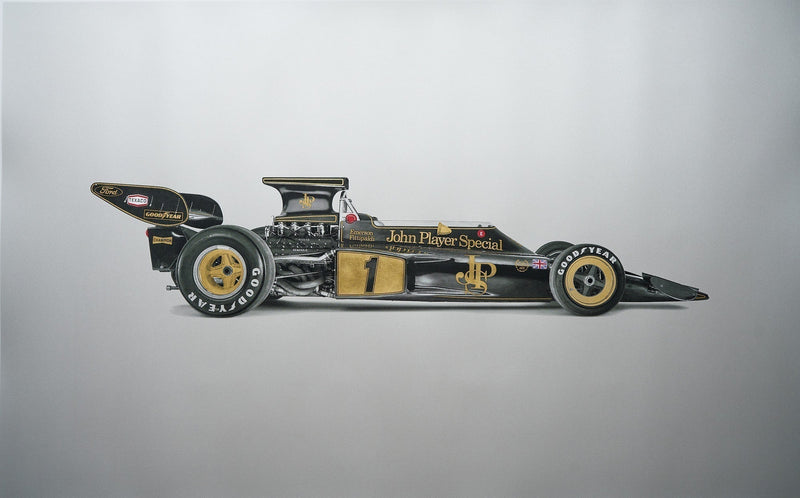
It’s hard to imagine where he finds the time to create art after spending his days at Jaguar, but he does manage it, and he spends those hours producing unique, colorful, distinctive artwork that captures icons of vintage motorsport with a fresh perspective. You know these shapes well, have memorized their forms down to the smallest curves and kinks, but Thomson’s presentation offers a novel view of these cars that we’ve so long ago seared into memory. We’re proud to offer a selection of his work in the Shop, for each piece is an interesting blend of technicality and artistry, much like the cars themselves.


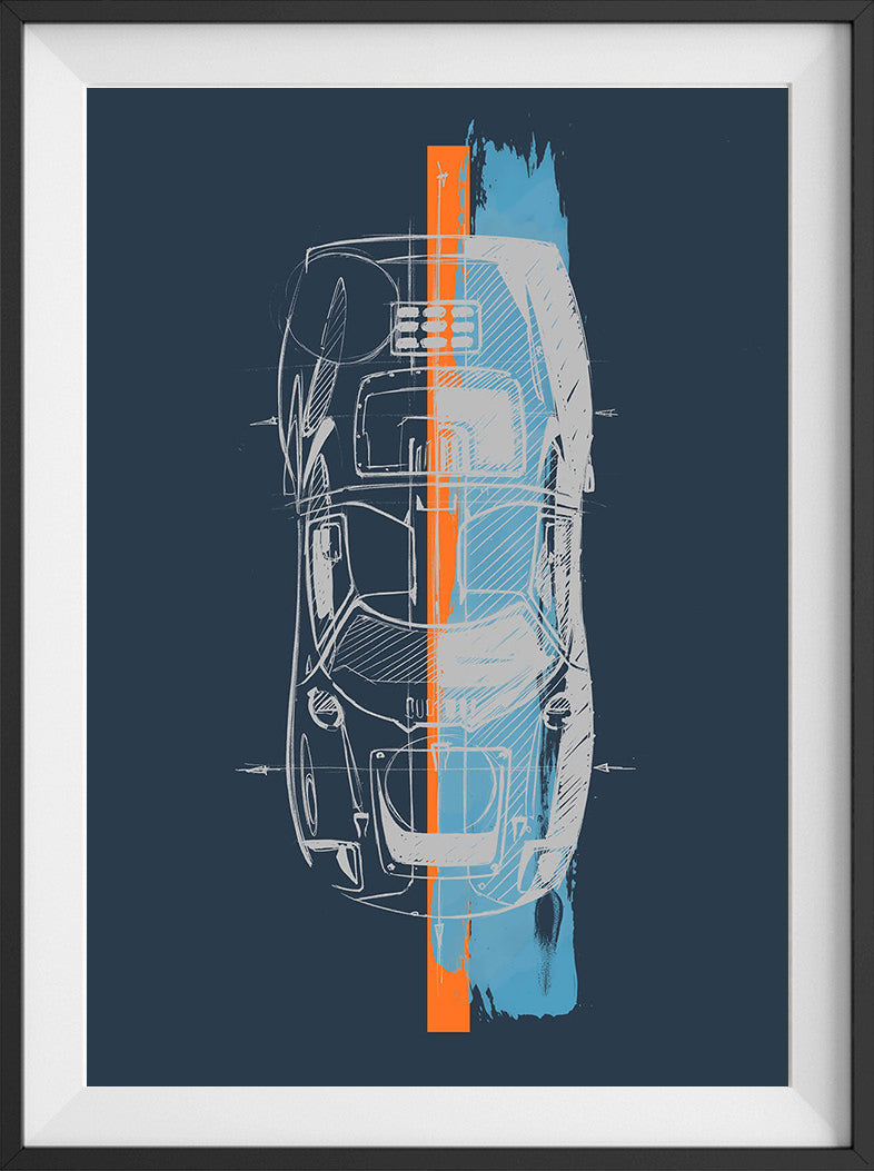
The top-down angles on the Porsche Turbo, Ford GT40, Jaguar XKE, and Ferrari 250 GTO appear as if a pop artist got his hands on some technical drawings and the brightest pigments from Pantone to play with. The first thing you might notice is that the subjects in this series have a sketch-like blueprint quality to them, what with their architectural levels of proportional accuracy and details like superimposed axles and the inclusion of just about every seam line. They evoke mathematics, wind tunnels, careful and rigorous work. Then, on top of these precise aerial outlines, Thomson applies big slashes of vibrant color to provide both literal and figurative contrast. There’s nothing random about it though, as the choice of hues hints at the racing pedigrees and origins of these machines, and the vertical orientation of the stripes reinforces the symmetry.
The result is striking and saturated, precise but exciting. They feature cars, but the pieces are far from “man cave”-quality art that only belongs in the garage. In the same way people pay millions to have Campbell’s Soup cans on their living room walls, this collection brings loud color and geometric precision together with harmony, especially taken as a set of four. You can purchase the full collection from the Petrolicious Shop, or just pick out your favorite to give your blank walls something to do.
You can find our collection of Julian Thomson's artwork in the Petrolicious Shop

