

In this context, shouldn’t it be, “Lots Of Triumph, Usually Stylish”?
Never before has a line summed up a car as cleverly as, “Lots Of Trouble, Usually Serious” to explain the five letters in Lotus. It’s a near-faultless gag, but this should not be applied to the company as a whole. For a brand synonymous with so many problems, it equally has had its fair share of positive accolades. Innovations in handling, balance, styling, vehicle construction—to not even scratch the surface.
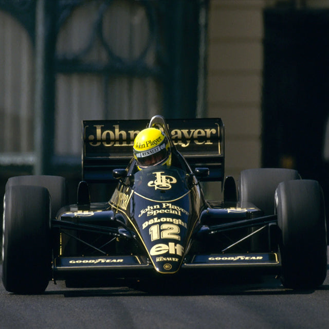
Think Lotus, though, and you think racing. And when we think Lotus and racing, it’s got to be a black-and-gold John Player Special.
In all of the articles I’ve written on speed icons so far, the word “cool” has barely been used in describing an iconic racing livery.

The JPS cigarette branding is a perfect example of how simplicity and style always works. Paint it black, add a gold JPS logo, and you have instant and unmistakable branding. Of course, the same can be said for all of the best-loved racing liveries but no others have this air of ’70s sophistication about them.
It’s an elegance that didn’t just stay on the track. Throughout the paddock, team JPS looked as though a French couture house had gone racing! For me, they optimised the “glamour era” of motor racing.
The JPS livery is certainly well-documented, however, there is an angle that often goes unmentioned, and it’s that of the John Player Special livery away from the track. There’s an image of Colin Chapman sat on his Lotus Esprit, parked in front of the JPS private plane—and this, for me, was the ultimate in racing chic.
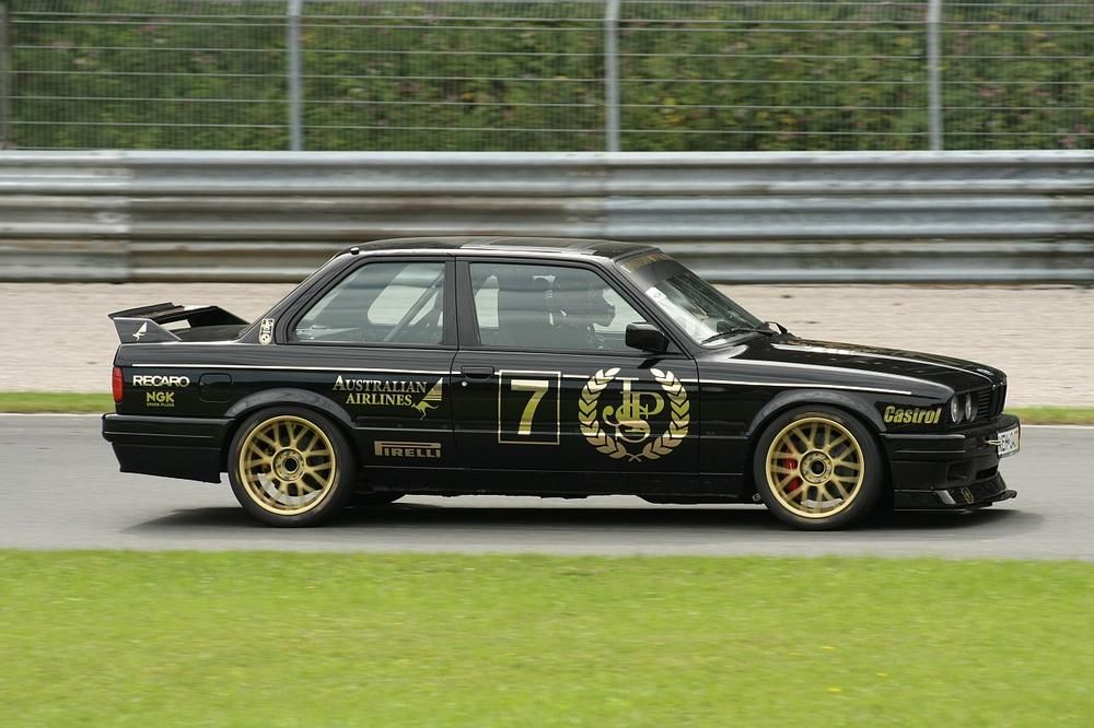
It’s such an aspirational scene for a motorsport fan that everyone who followed John Player Team Lotus wanted to be a part of it somehow. And they could! Aside from the usual team merchandise of badges, caps and jackets, you could have a JPS-liveried road car! The special edition road cars never left you needing for more. Bar the odd number plate and minimal amount of other stickers, one pretty much had the ability to park an actual racing livery in the drive.

Thanks to Lotus and JPS, we have one of the very few colour schemes that moved from track to road. There aren’t many examples where you found your favourite racing livery available as a factory special edition. This, of course, was another goal for the design, as back in the day when car manufacturers had special editions, none were more so special – especially when compared to other efforts like the Triumph TR7 Coca-Cola car.
Another line successfully crossed off is the terribly thin line between road cars with racing liveries looking cool or looking tacky, but be it special editions from Lotus, Ford, BMW and Norton, the thin gold lines on jet black never crossed over to the tacky side.
This simple, elegant approach to the design lent itself perfectly to road-going versions, but the idea of using just a two-colour livery is incredibly brave in the formula one arena. This was the era when the grid was awash with multi-coloured iconic liveries that should have drowned out the JPS cars. Not much chance of that, though, as the slick black and gold cut through the pack.

Even the current Lotus sponsored racing livery was drawn from the original JPS design, with most sponsor logos all in the same gold.
I’m left with the usual feeling that simpler times warranted simpler demands. The days when a gold stripe, wheels, and logo made a simple car special, and a basic two colour design made for a legendary racing livery.
Importantly, from the pits to the showroom, and right down to the toy store, whatever your budget or age, you could own a bit of black and gold magic, another first for Lotus.
Just don’t think too much about theactual product being advertised by John Player Special…best get a pit crew shirt instead.


Image sources: pinimg.com, wikipedia.org, photobucket.com, sennafiles.com, pinimg.com Artwork by Joel Clark
Never before has a line summed up a car as cleverly as, “Lots Of Trouble, Usually Serious” to explain the five letters in Lotus. It’s a near-faultless gag, but this should not be applied to the company as a whole. For a brand synonymous with so many problems, it equally has had its fair share of positive accolades. Innovations in handling, balance, styling, vehicle construction—to not even scratch the surface.
Think Lotus, though, and you think racing. And when we think Lotus and racing, it’s got to be a black-and-gold John Player Special.
In all of the articles I’ve written on speed icons so far, the word “cool” has barely been used in describing an iconic racing livery.
The JPS cigarette branding is a perfect example of how simplicity and style always works. Paint it black, add a gold JPS logo, and you have instant and unmistakable branding. Of course, the same can be said for all of the best-loved racing liveries but no others have this air of ’70s sophistication about them.
It’s an elegance that didn’t just stay on the track. Throughout the paddock, team JPS looked as though a French couture house had gone racing! For me, they optimised the “glamour era” of motor racing.
The JPS livery is certainly well-documented, however, there is an angle that often goes unmentioned, and it’s that of the John Player Special livery away from the track. There’s an image of Colin Chapman sat on his Lotus Esprit, parked in front of the JPS private plane—and this, for me, was the ultimate in racing chic.
It’s such an aspirational scene for a motorsport fan that everyone who followed John Player Team Lotus wanted to be a part of it somehow. And they could! Aside from the usual team merchandise of badges, caps and jackets, you could have a JPS-liveried road car! The special edition road cars never left you needing for more. Bar the odd number plate and minimal amount of other stickers, one pretty much had the ability to park an actual racing livery in the drive.
Thanks to Lotus and JPS, we have one of the very few colour schemes that moved from track to road. There aren’t many examples where you found your favourite racing livery available as a factory special edition. This, of course, was another goal for the design, as back in the day when car manufacturers had special editions, none were more so special – especially when compared to other efforts like the Triumph TR7 Coca-Cola car.
Another line successfully crossed off is the terribly thin line between road cars with racing liveries looking cool or looking tacky, but be it special editions from Lotus, Ford, BMW and Norton, the thin gold lines on jet black never crossed over to the tacky side.
This simple, elegant approach to the design lent itself perfectly to road-going versions, but the idea of using just a two-colour livery is incredibly brave in the formula one arena. This was the era when the grid was awash with multi-coloured iconic liveries that should have drowned out the JPS cars. Not much chance of that, though, as the slick black and gold cut through the pack.
Even the current Lotus sponsored racing livery was drawn from the original JPS design, with most sponsor logos all in the same gold.
I’m left with the usual feeling that simpler times warranted simpler demands. The days when a gold stripe, wheels, and logo made a simple car special, and a basic two colour design made for a legendary racing livery.
Importantly, from the pits to the showroom, and right down to the toy store, whatever your budget or age, you could own a bit of black and gold magic, another first for Lotus.
Just don’t think too much about theactual product being advertised by John Player Special…best get a pit crew shirt instead.
Image sources: pinimg.com, wikipedia.org, photobucket.com, sennafiles.com, pinimg.com Artwork by Joel Clark


