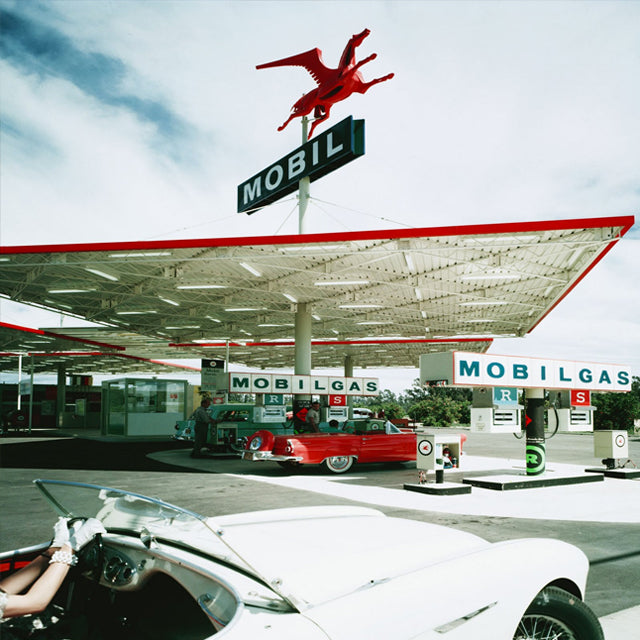
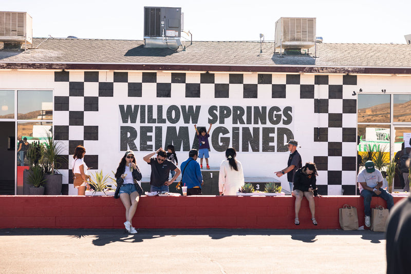
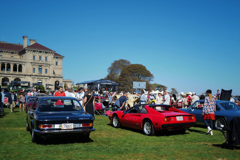
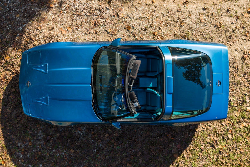
Yes, we’re cherry-picking some fantastic examples of retro gas stations, and yes, many older stops were little more than some pumps and attendants—but what gives? Why can’t all stations look fantastic?


Now, with more choice than ever, you’re able to buy cars that run on electricity, biofuels, diesel, propane, gasoline, and hydrogen. Perhaps an enterprising firm could transform the forecourt into an area that attracts customers who actually want to be there, instead of the get-in-and-get-out cycle that happens today.
I’d gladly hang out at a modernist gas station. In fact, beautiful but disused designs, like Ludwig Mies van der Rohe’s Nun’s Island station near Montreal, Canada or the ex-Agip station at Piazzale Accursio that Mario Bacciocchi designed are finding new life today. The former is now a beautiful community centre, while the latter is headquarters for Lapo Elkann’s innovative Garage Italia Customs.
Just think: the station down your street could have looked like one of these structures…


Image sources: eni.com, reddit.com/r/RetroFuturism/, palmspringslife.com, italianways.com, flickr.com, wallawalladrazanphotos.blogspot.com, tabletmag.com, moderndesign.org


