If sponsorship worked as well as marketing directors wished, an awful lot of motor racing fans would be certified alcoholics. We’d, no doubt, spend our lives totally pished thanks to the huge number of alcoholic beverages advertised in motorsport over the years.
But as a brand to inspire some of the most iconic liveries ever, one brand stands above all others: Martini.
For me, the world of racing car sponsorship doesn’t have another all-rounder design anyway near as strong as Martini Racing’s, and the past 45 years have seen the Martini-liveried cars eclipse every other car on the starting grid in looks alone—no matter what the formula! But how is this possible?
So sit back, grab a drink, and let’s getsozzled on a number of the finest examples to wear those intoxicating Martini stripes.


The very first cars Martini sponsored didn’t carry the distinctive stripes, and were very basic in their design in accordance with the era. These were the 1962 Alfa Romeo SZ and later in 1968, the Porsche 907. It wasn’t until very late in 1970 that Martini Racing officially began, with the sponsorship of the 917 competing in the 1971 World Sportscar season. If ever a debut had equal impact, surely Martini Racing would be up there with Elvis first shaking his hips.
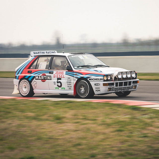
Martini, to the casual viewer, obviously seem synonymous with fellow countrymen Lancia, and most people would first think of Lancia because of World Rally Championship coverage in the ’80s. Porsche comes in a close second with equal dominance during the ’70s and having revisited the livery in recent years—even appearing on modern WilliamsF1 machines.
But in my opinion, the nicest mix of car and livery has to be the Martini Racing Alfa Romeo 155 DTM cars.
As if the DTM tarmac-chewing-monsters don’t look incredible enough as they are, covering the angular 155 in those stripes is pure car porn, be it the white or red-based examples. Similar in affect to many other Martini Racing designs, the graphics on the 155 superbly accentuates the car’s shape, turning aggressiveness up to eleven.
Even on a grid full of the most radical saloon cars we’ll likely ever see on this earth, it still holds the honours of being the most menacing, purposeful-looking race car.

It also carried the designed-in-1929 Martini “Ball and Bar” logo in an unusually large size, yet this didn’t sully the design in any way: a rare occurrence when the client asks for an ever-bigger logo!
But perhaps the greatest achievement of the Martini Racing colors is that each type of car has its own different take on the livery. Each design is adapted to complement whatever car it's applied to, and it’s significant: this is a luxury only well-loved brands can get away with.
Think about the Alitalia livery, for example. As superb as that design is, it won't take too much alteration from its classic look, and is truly at its best on the side of a Lancia Stratos. This is by no means a criticism, only a point of comparison between the looks-good-on-almost-anything Martini Racing colors.
However, with so many variations out there, it's inevitable we're going to find a few bad apples in the crop. As far as the iconic Martini Racing livery is concerned, my vote for least exciting has to be the current WilliamsF1 incarnation. Park it next to a WRC Lancia Delta, and it looks weak and wispish.
What’s your favorite car to wear the Martini Racing colors?


Image source:blenheimgang.com


