Niels van Roij’s work has previously been featured on Petrolicious in the form of his beautifully assembled book on Fiat’s Dino Coupé, and we are now pleased to add a selection of his original artwork to our shop as well. Niels’ pieces include treatments of oddballs like the Ferrari 412, a unique presentation of the raw aggression inherent in the 365 Daytona, a careful study of Porsche’s 356, and other inspired takes on such timeless modern classics as the Porsche 928 and Ferrari 288 GTO.

These cars have graced many canvases, have been rendered countless times with modern software, and have surely been drawn by kids and adults alike since the day of their debut, so we wanted to get Niels’ take on how he landed on the daunting task of doing artistic justice to these iconic cars in a fresh way.


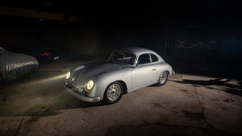
Upon seeing his collection, it’s immediately apparent that there’s no cut-and-paste business going on here: each piece has a unique look and feel to it that complements the subject matter. The process is different for each new project, and Niels describes his approach to the selection of cars as being one of natural affinity. None of his choices are done so with regard to popularity, price points, trends, none of that. What matters is how he connects to the car; it has to be something that has the right character. And when he lands on a car to render in Wacom, the platform of choice for car designers like Niels, the essence of the vehicle informs his treatment. For instance, the 356 is formed by soft lines and long sweeping radii, so appropriately, Niels’ piece is done in a very dream-like, very soft style that pays tribute to the original design of the car.

There’s a similar story for all of the pieces he does, with another example of this design ideology seen in the unique, multi-piece Ferrari Daytona offering. He asks first, “What is the true nature of this car? What gives it its identity?” And for the Daytona, this meant stripping away the pieces of the car that while beautiful in their right, aren’t necessary in identifying it. So, emphasis is placed on the aspects which make the Daytona, the Daytona. The result is a bunch of different physical pieces that once hung together achieve unity and coherence.

Niels has been drawing cars since toddling age, and now he is an independent car designer with his own studio in London, so clearly this is somebody who’s a true car enthusiast in it for the long haul. If you’d like to hear from the man himself his thoughts on design, check out this video where he explains his work, the thought processes behind it, and what good design means to him.


