

Literature and other information is quite thin on the ground for Stuttgart painter and commercial graphic designer Hanns Lohrer (1912-1995), which is surprising because today he is considered one of the pioneers of German postwar graphic design. Aside from his other work, Lohrer played a pivotal role in the visual appearance of the Porsche brand during the 1950s and '60s. As Porsche’s first “advertising designer”, Lohrer carefully guided the company’s message through visual marketing, and firmly established what the Porsche brand identity would become.


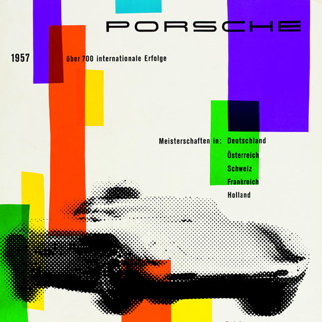
When Porsche launched their first model, the 356, in 1951, the company initially supported it with very basic advertising. And what advertising there was, was mostly presented in the form of performance statistics–essentially a list of technical details and early racing victories to extoll the car's innate virtues. Ferry Porsche, the company’s head, and founder, was initially not fond of advertising. Colorful advertising pictures made him distrustful, which makes some sense, as his training was as an engineer. He would have surely thought that the technical data would have been enough for the consumer to make a wise decision. Word of mouth, and reputation about the automobiles themselves was what Ferry Porsche was comfortable with, trusting that these would spread within the sports automobile driver community. Lohrer would soon change that.
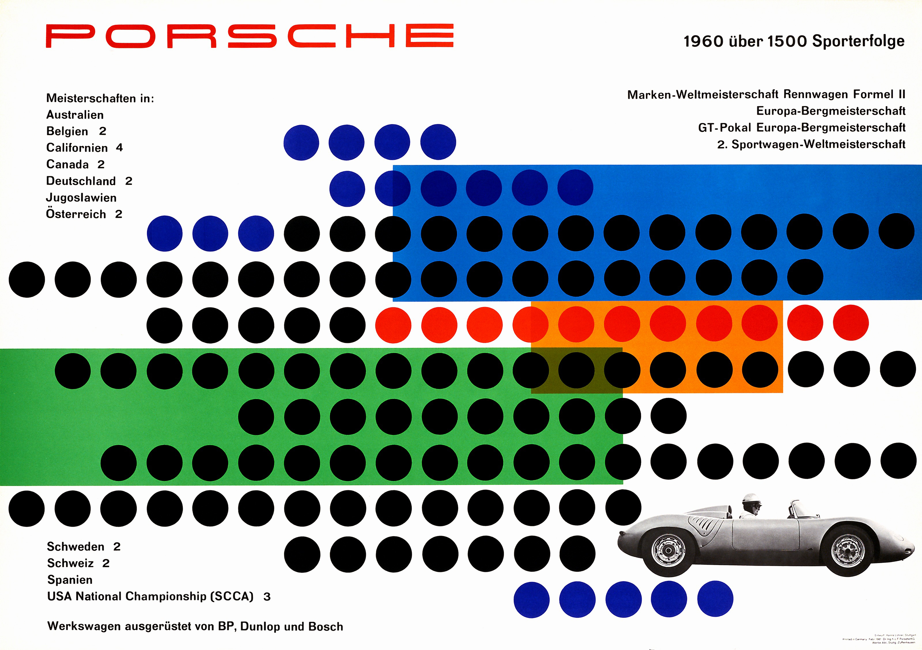
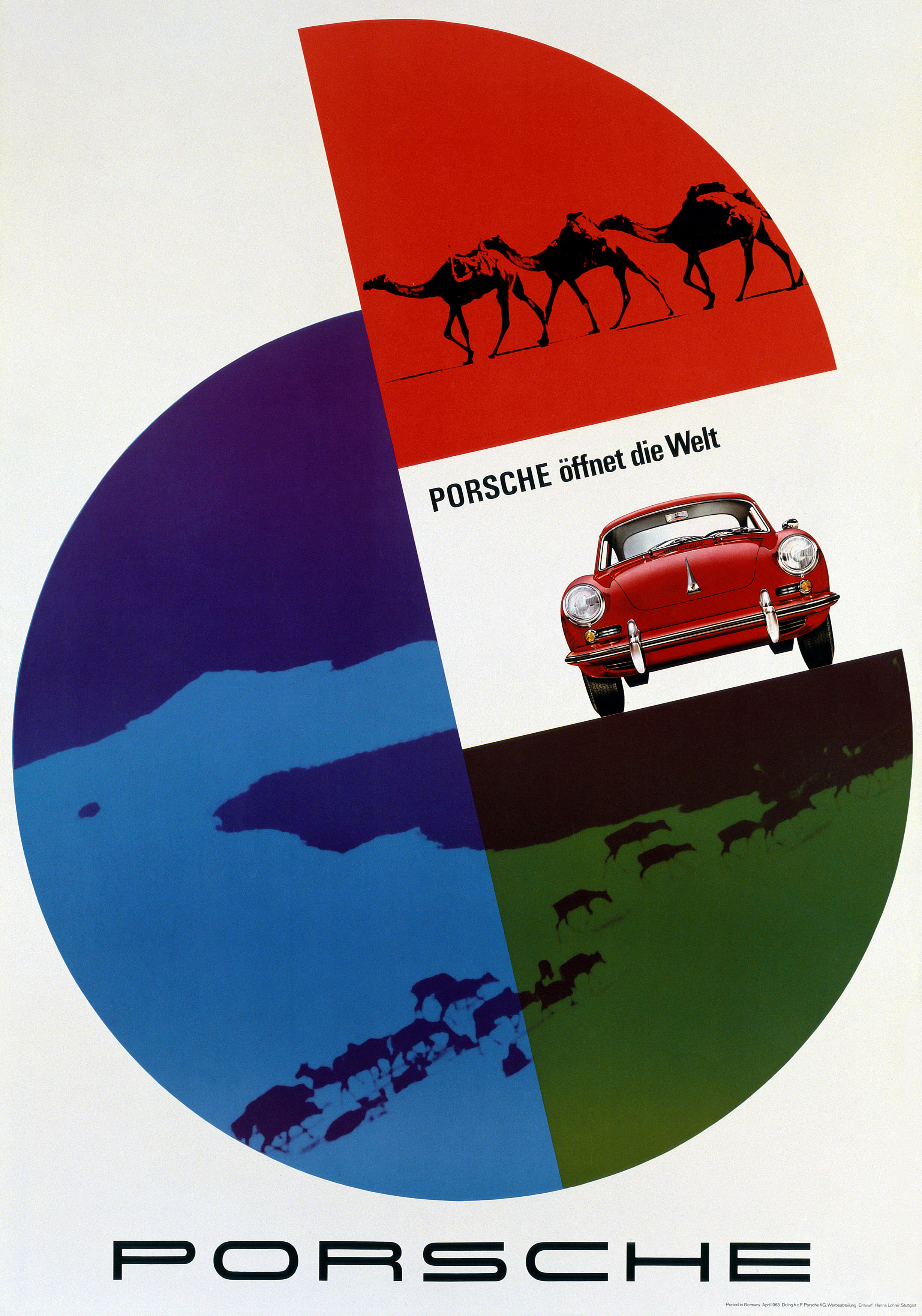
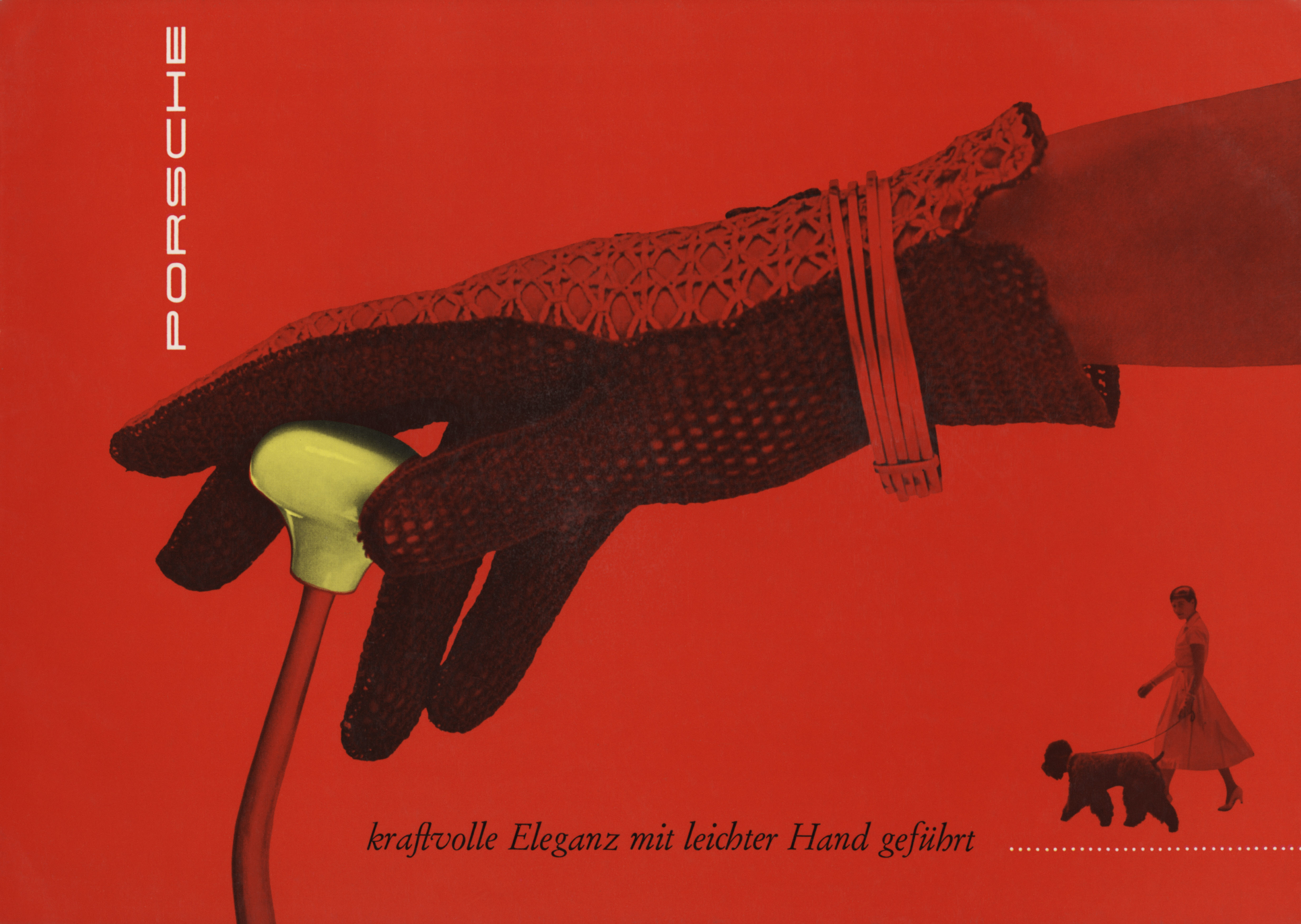
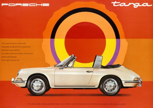
Lohrer, partly pulling a page out of the American advertising illustration playbook, took the focus off the car, and put it firmly on the “lifestyle”. While this is common advertising jargon, and practice now, during the 1950s, it was just starting to come into its own. In Loher’s compositions for Porsche, status symbols often take center stage–a riding saddle, a set of golf clubs, hunting rifles, a shapely leather glove, a couture bag, a well groomed dog–these are all things that seem to indicate a certain luxury, exclusivity, and elegance–all attributes that Porsche's are known for today. Lohrer’s posters often utilized bold, bright eye–catching colors, and unconventional fonts. One of his most well known is a design for a poster for the Porsche 356A where one did not even see the advertised car. On a bright red background you see a lady's gloved hand gracefully holding a stick shift. The caption, roughly translated states "powerful elegance, made with a light touch”. It’s a classic aspirational strategy today. Lohrer also created a series of victory posters at the end of every year to visually capture Porsche’s motorsport successes. Again, Lohrer strove to take the focus off the boring “data” as it were and spins the focus onto another object.
Besides his twenty-odd years with Porsche, Lohrer also worked on design projects for Mercedes Benz, the German Red Cross, and Olympia typewriters. His work drew the viewer in with sometimes uncommonly simple images. His work for Porsche showcased their products not only as a car, but also as something to aspire to.


Image Sources: wordpress.com, wordpress.com, wordpress.com, tumblr.com, wordpress.com, pinimg.com, pinimg.com, wordpress.com, wordpress.com, wordpress.com


