Journal: What Makes The Alitalia Racing Livery So Compelling?

What Makes The Alitalia Racing Livery So Compelling?

By Joel Clark
May 19, 2015

Photography by Federico Bajetti

Speed Icons.

Every motorsport fan has a favorite driver, a favorite team and a favorite car, but how many can mention a favorite racing car livery, so easily? Fortunately, I can think of many—and that’s why, in my regular series, I’ll be bringing you a collection of outstanding examples of motor racing liveries, both well-known and not-so.

But who am I, Joel Clark? I am the artist behind speedicons.com. You may have seen my work featured here on Petrolicious, in fact. I create works depicting race and road cars, by hand-cutting the very same vinyl that is used when creating racing car (or motorcycle) liveries.

I hope to bring you a mix of well-known and not so well-known liveries—and explain why they’re so compelling.

To kick things off , where better to start than with the letter “A”, for the Alitalia-liveried Lancia Stratos. A double-whammy of Italian classic design, it doesn’t get much better than this.

I say Italian, but the Italian national airline’s corporate image was originally created by the highly renowned San Francisco-based German designer Walter Landor, whose agency produced some of the most iconic branding ever. Along with Alitalia, the firm is responsible for the “Cotton” logo (on everything), Levi’s, Del Monte, Frito-Lay, the World Wildlife Fund, and FedEx—do you see the hidden arrow?

Back to the glorious Alitalia Stratos. Certain liveries are always associated with particular cars—even when the livery has adorned many different types and eras of race car, and the Alitalia Stratos is a prime example.

Sure, there are plenty of other cars sporting variants of the Alitalia logo, but this particular combination is the most successful. Think of Marlboro on the early 90’s McLaren MP4/5; again, there have been endless cars with the same cigarette sponsor, but none were more effective or memorable (that recognition does, of course, owe much to the car’s driver).

Here, however, the marriage of Landor’s timeless logo and the drop-dead gorgeous Stratos where a match made in the stratosphere. But why does it work so well on this car?

Landor’s original design brief from Alitalia was to create graphics that had to be adaptable to a complex variety of aircraft—not an easy challenge. The airline also needed modernising to keep up with the rapid growth in air travel.

Landor set out to create yet another iconic piece of branding—or “design” as it was called back then. A corporate communications manual was also created and gave detailed instructions as to all possible uses of the logo, though I haven’t been able to find out who adapted the logo for the Stratos—and whether those rules applied to the use of sponsorship.

Saying that, though, the adaption on each side of the car (minus number plates etc.) looks as if it has been lifted straight from the side of an airplane, and is equally at home over the rear haunches of the Stratos. I’d love to think that Landor played a prominent role in the livery’s design—but it’s difficult to find evidence of this—so if anyone out there knows who did design it, do leave a comment and we’ll update this piece accordingly.

Whoever it was, though, must have had the same level of taste and design ethics to keep things so simple, yet clever. The shape of the mirrored tri-color “A” creates sits atop the Stratos perfectly. The lines and shape of the car show off the logo, and the lines and shape of the logo show off the car in equal measure.

Never has a bird’s eye view of a car looked so good—and in helicopter coverage, you can always spot the Stratos from a mile away.

With the livery, the whole car somehow becomes a far more aggressive package—not that the Stratos needed it. I have been to many classic car meets, where one always finds a plentiful selection of replica Stratos on show.

The ones dressed in Alitalia graphics are always surrounded by the Instagram crowd—fitted with “Canary Yellow” wheels, especially so.

You must not forget that both the Stratos and Alitalia branding originate from the late ’60s, and when they eventually came together in 1974, there wasn’t much to touch them—and there still isn’t today. A Lancia Stratos wearing Alitalia livery falls into the same mindset one should take when buying a Lamborghini: the car is already eye-meltingly radical, so trying to go for a discreet paint scheme defies the point! After all, the original Alitalia logo still looks as modern and fresh today as it did almost 50 years ago, and Stratos can claim the same accolades too, 40 years on.


Join the Conversation
0 0 votes
Article Rating
Subscribe
Notify of
0 Comments
Inline Feedbacks
View all comments
John Miles
John Miles
8 years ago

I still have the Lancia 037 model adorned on Alitalia glory my Dad and I put together. I was less than 8, but he was showing me how to soak the decals and carefully put them on the chassis.
Per Eldh
Per Eldh
8 years ago

This.

Per Eldh
Per Eldh
8 years ago

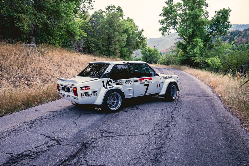
Surprised to see You NOT mentioning the most iconic, successful (three WRC titles) Alitalia rally car – the Fiat 131 Abarth

Ian Miles
Ian Miles
9 years ago

Certainly an iconic livery. The Integrale livery with Martini must be up there. The dark versaion rarer but even better. JPS Lotus though is difficult to beat.
Interesting article, more of these would be great.

Louis Emelina
Louis Emelina
9 years ago

When someone says “Alitalia” to me, I think of two things: going home to see my family, and THAT Stratos.
Now I wouldn’t know why the livery is so “compelling” on any other vehicle, as I’ve spent much less time dreaming about them as I have with Lancia and Bertone’s lovechild. Or should I say lovebeast?

Part of the reason why it is so good looking to me is because the very lines of the logo suit the car’s design features. The Gulf livery has rounded corners, a certain simplicity that you can find in the design of the GT40 that wore it. The Alitalia livery is very angular, pointy, aggressive, much like the Stratos itself, along with it’s shape. I suppose that’s were the key of livery design is: making the livery and the car seem like one single entity, much like a bespoke suit has to meet the very features of it’s owner. Yet how they managed to achieve such a match is remarkable. The Stratos is a very simple car (shape wise), and so is the Alitalia livery: very few colours, similar angles and similar proportions, but the end result makes for a complicated product, that doesn’t have this sense of weight like the touring cars of the 80s and 90s had. It’s not so much a car having a sponsor, as it is a sponsor having a car …

Edward Levin
Edward Levin
9 years ago

Great logo design, and great livery for a Stratos. But they didn’t get it right until the second try; the first Alitalia Stratos livery didn’t have the design as well integrated:
http://media-cache-ec0.pinimg.com/736x/76/5a/0c/765a0c56ad21f161002054af24a8d167.jpg

Joel Clark
Joel Clark
9 years ago
Reply to  Edward Levin

Thanks for posting the link Edward. I didn’t come across that example in my research. I’m now amazed how they managed to make two big designs look so small and retiring!

Edward Levin
Edward Levin
9 years ago
Reply to  Joel Clark

Lancia also briefly ran a Gp. 4 Beta in Alitalia colors.

Douglas Anderson
Douglas Anderson
9 years ago

It’s all a bit too busy for my taste lately .
I like the current Williams F-1 livery for its simplicity and cleanness . I appreciate that sponsors want and need their logo in every ones face but let’s not forget who made the bloody vehicle , spent the time to develop it . Then we need a discussion about the specific colors of each countries basic plan/graphic to identify who they are and where they come from .

Joel Clark
Joel Clark
9 years ago

I’ll be writing about Martini in the series and funnily enough I’ll be mentioning how I think the current Williams incarnation of the classic livery lacks the usual impact. It’s all a bit to thin and stringy – something of nothing. If it was the first ever time Martini had sponsored a car and we hadn’t been used to the iconic Lancia’s and Porsches’ of old, I’d agree with you Douglas. Thanks for your comment tho’.

Louis Emelina
Louis Emelina
9 years ago
Reply to  Joel Clark

Agreed: the “new” Martini livery lacks some panache. I think it suits the car’s lines well, but it’s too light. A Martini livery should make a statement, it should be as brutal and as bold as the hit of a sledge hammer to the back of the head.
Funnily enough, similar words could be said regarding the McLaren livery (hoping you’ll do a column on it too), but perhaps there are commercial and legal reasons as to why they couldn’t go back with the aggressive red and white … (you know, red + white = Marlboro, and tobacco and advertising don’t mix anymore, and maybe Marlboro didn’t want to be associated with a recently-mediocre-now-back-of-the-pack-team as well – food for thought)

Joe Laurieri
Joe Laurieri
9 years ago

Of the 3 most popular and recognizable liveries of the same configuration .. this being one as well as the Martini Racing and Gulf liveries of the past. The Alitalia one is the one which is probably the most recognizable due to not only its colors but the racing history that goes with it.
The answer is clear the design is simple, tasteful, well balanced perfectly executed and easily recognizable. Properly executed striping on a single colored background usually are and as such easily recognizable when still as well as when at speed. As well perhaps the fact that so many Lancias and Fiats have won numerous rallies and championships with this livery probably helps…. lol.

Paul Steel
Paul Steel
9 years ago

Nice column idea, thanks Joel, I love your work.
Alitalia, it’s a simple design and great colour combination, it just looks right, on almost anything. It fits the Stratos particularly well, the car needs a livery that can accentuate it’s odd lines and shape, similar with the BMW 02 Martini livery. Looking forward to the other posts.

Guitar Slinger
Guitar Slinger
9 years ago

What makes the Alitalia livery so incredibly compelling ? Because its stunning yet tasteful . Beautifully designed and executed . The colors well harmonized . And , well , I could wax effusive for hours so suffice it to say : When it comes to racing liveries the Alitalia livery regardless of the vehicle or series is the absolute pinnacle of the graphic art form of racing liveries . The Gulf livery may be the more iconic . But its the Alitalia that is by far the most beautiful . I’ll shut up now before I fill the entire page . Thanks / mille grazie for putting a smile on my face today Mr Clark . After the day I’ve had this was the perfect antidote

Petrolicious Newsletter